Latest Collection of Illustrations
Most of these artworks have been created in Adobe Illustrator. There are retro posters with a Mid-Century vibe and tightly cropped graphic images often inspired by my photographs and collection of everyday items. Please contact me to see additional designs and discuss ideas for your unique project.
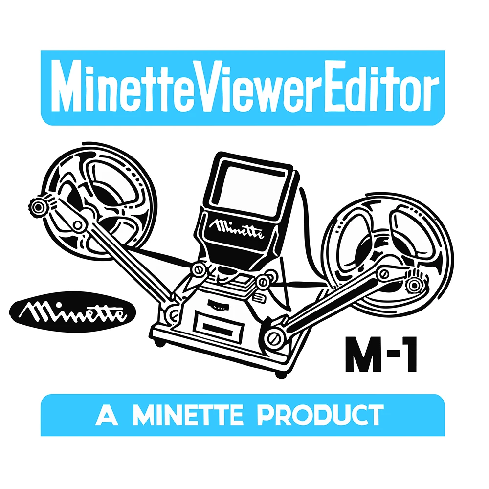
Minette Viewer Editor
This illustration was created to print on a T-shirt design. A small version would be printed on the front and a full size version on the back.
The old box was spotted in a charity shop in Swanley. The original had been damaged, so a lot of the design had to be re-created. I was able to use my photograph to reproduce the graphic with some typographic alterations.
First posted on Instagram 18 June 2025.
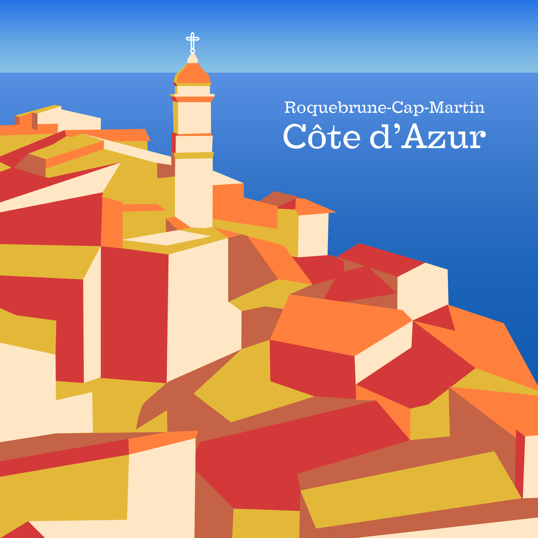
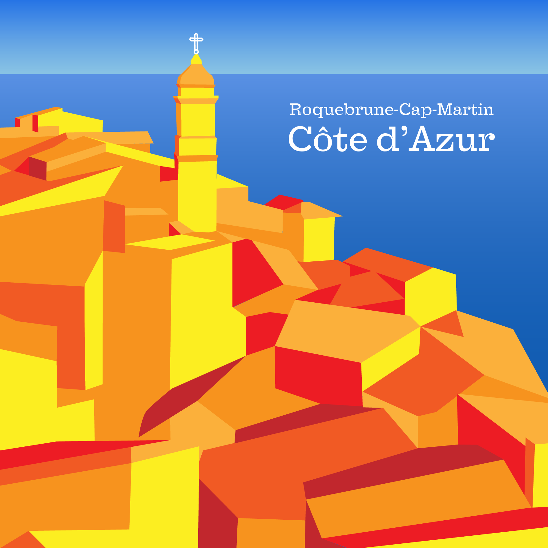
Côte d’Azur Poster
Roquebrune-Cap-Martin is a beautifully photogenic location on the French Riviera -or the Côte d’Azure. Even when I was taking the photograph, I was thinking it would make a great illustration.
Although the location was wonderful the rooftops were also covered in air conditioners and satellite dishes so an artwork could lose all of these.
The colour palette is limited to around 6 shades of orange, plus two gradients of blue for the background.
Posted on Instagram February 2024.
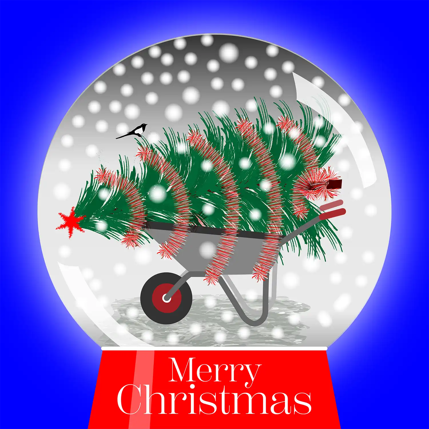
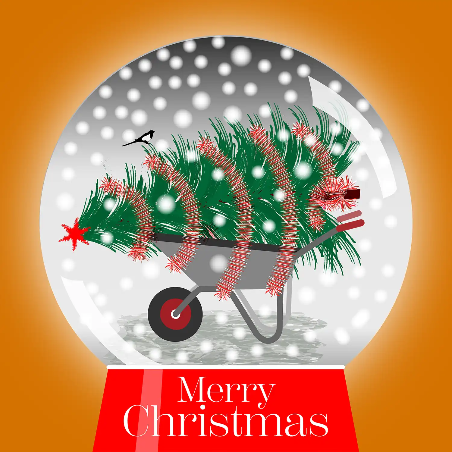
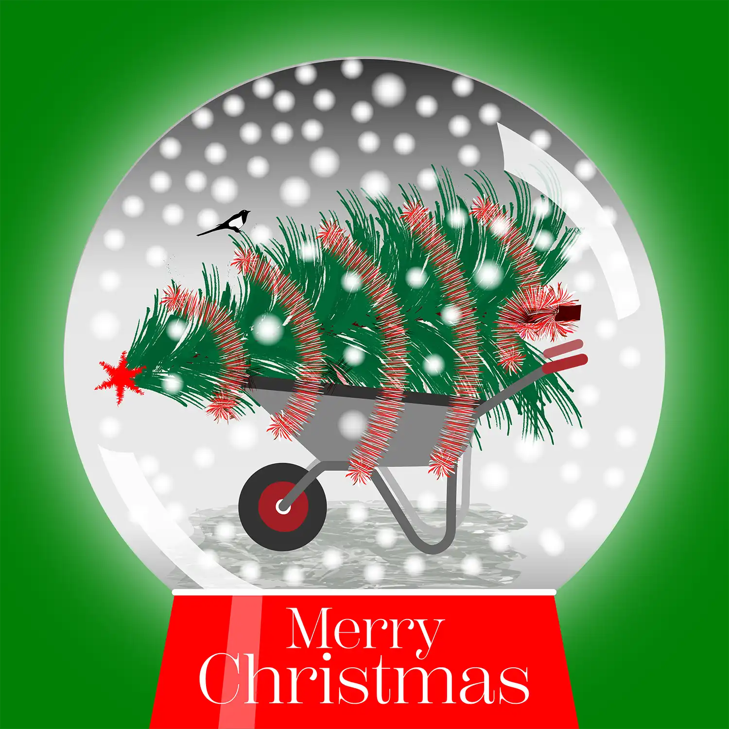
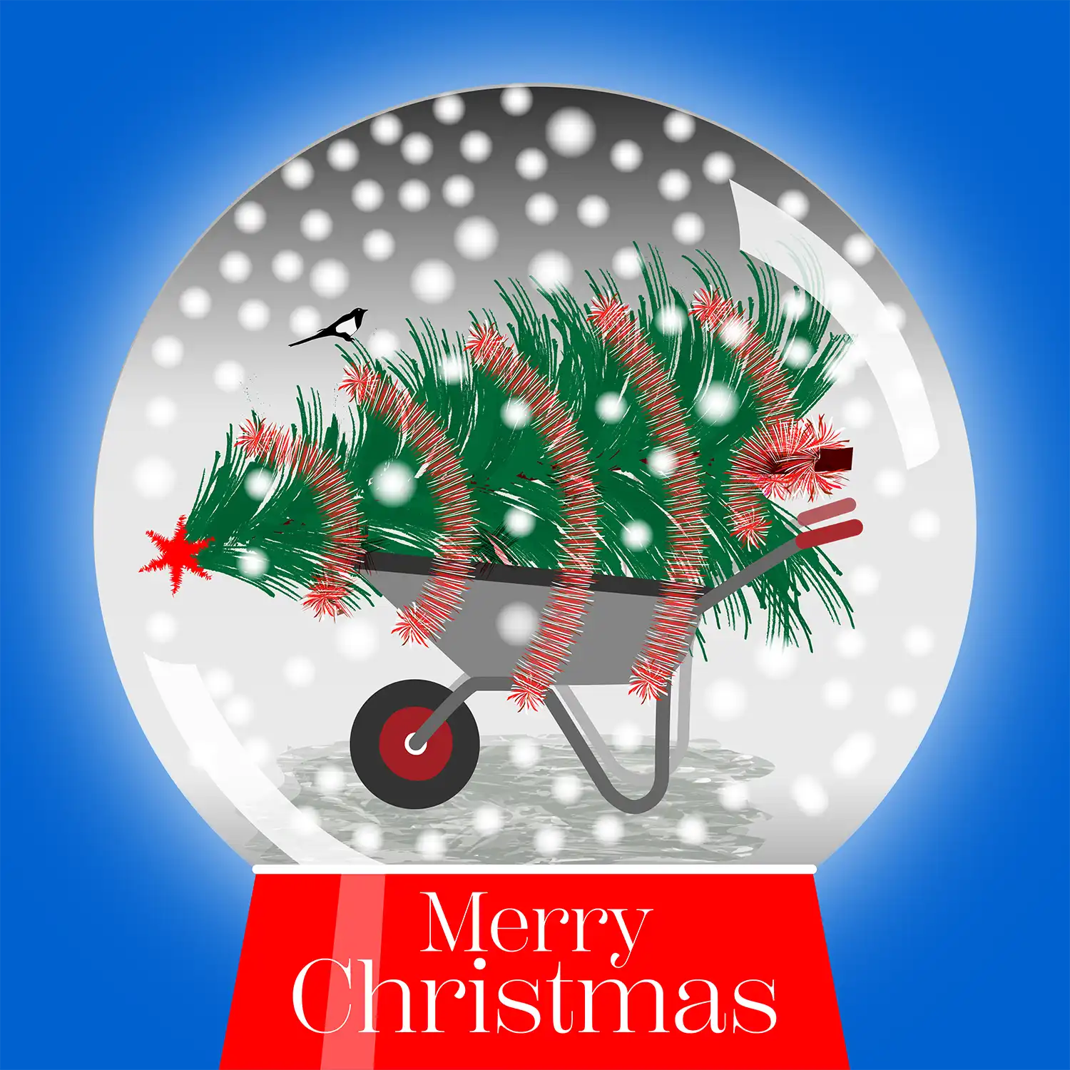
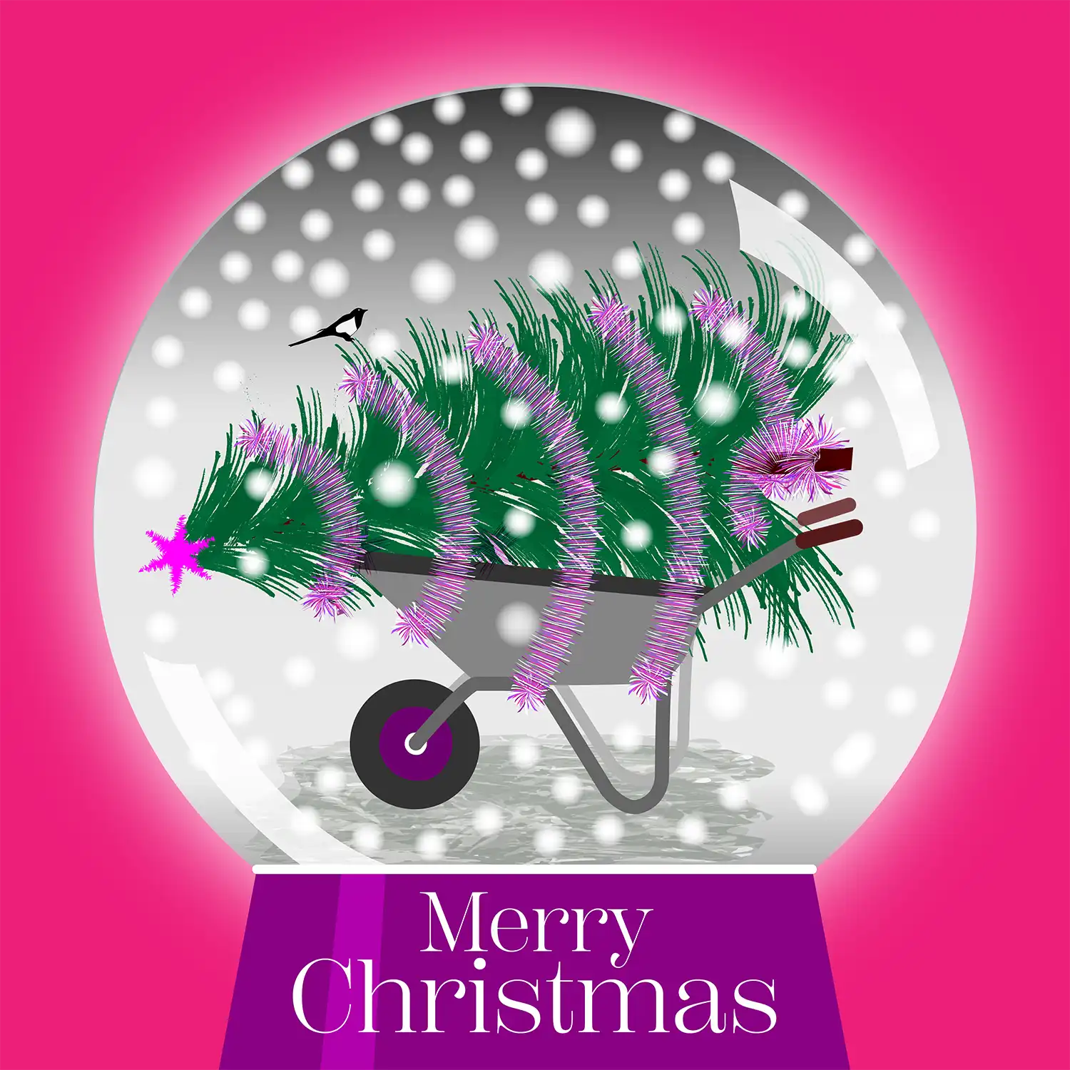
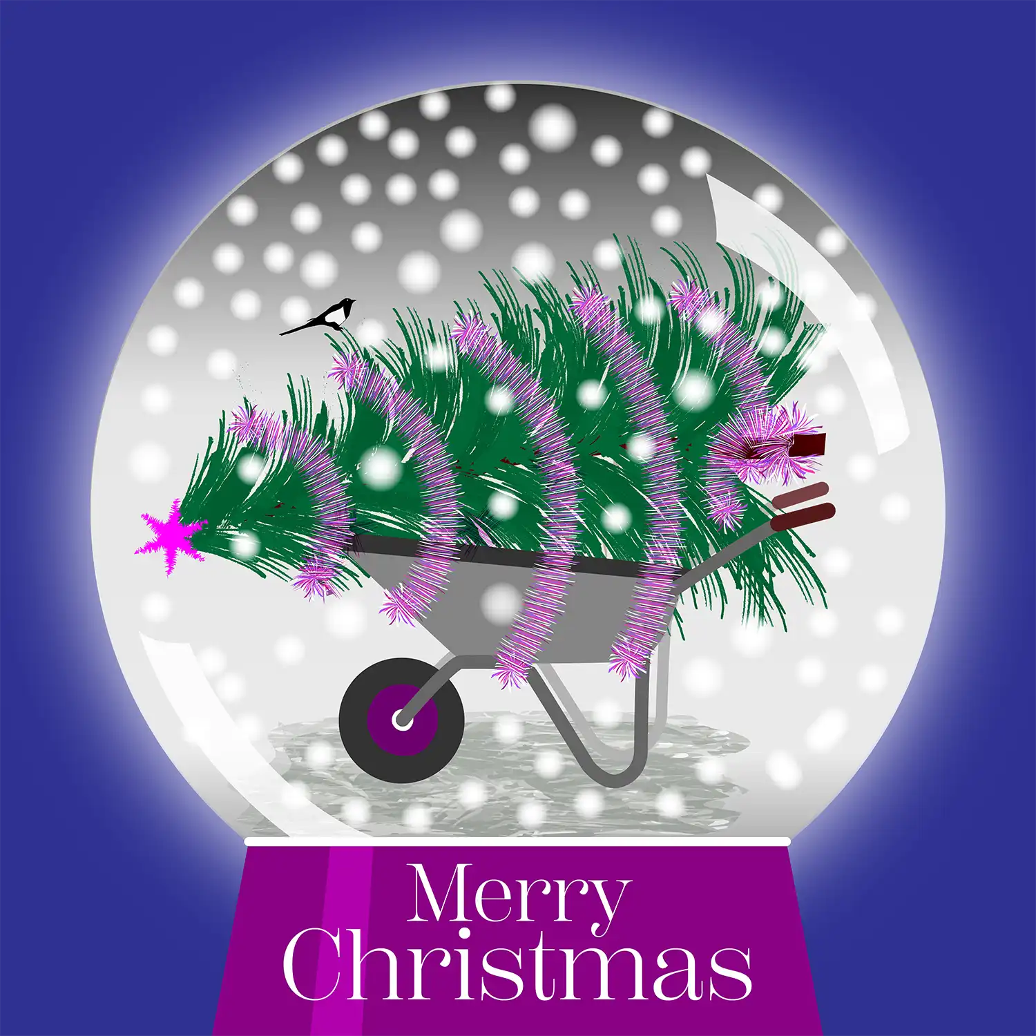
Tree in a Snow Globe
Christmas trees taken home always seem to be pictured strapped to the roof of a car. My version uses a wheelbarrow with spikey tinsel wrapped around to hold it steady. To make the globe more atmospheric I have added an outer glow and highlights.
Each colour variation alters not just the background and the base of the snow globe, but also the tinsel and the star on the top. Even the hand grips on the wheelbarrow vary so that the colours all work together.
Posted on Instagram ready for Christmas 2023.
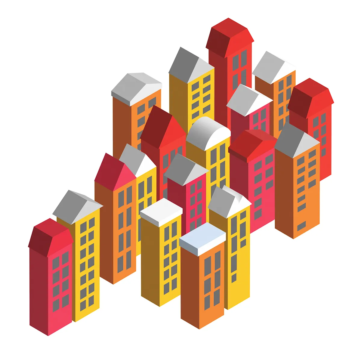
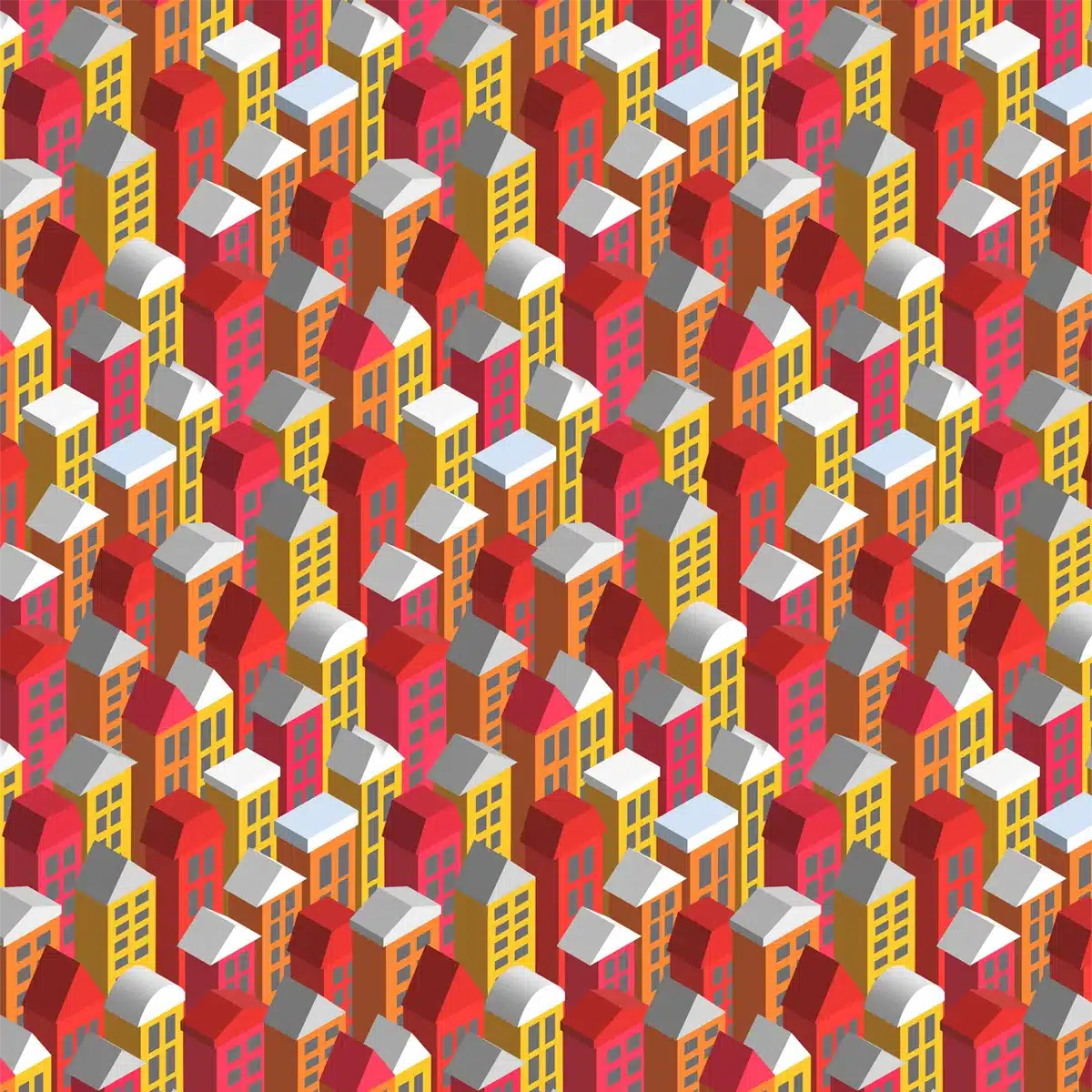
Homes Pattern 3D
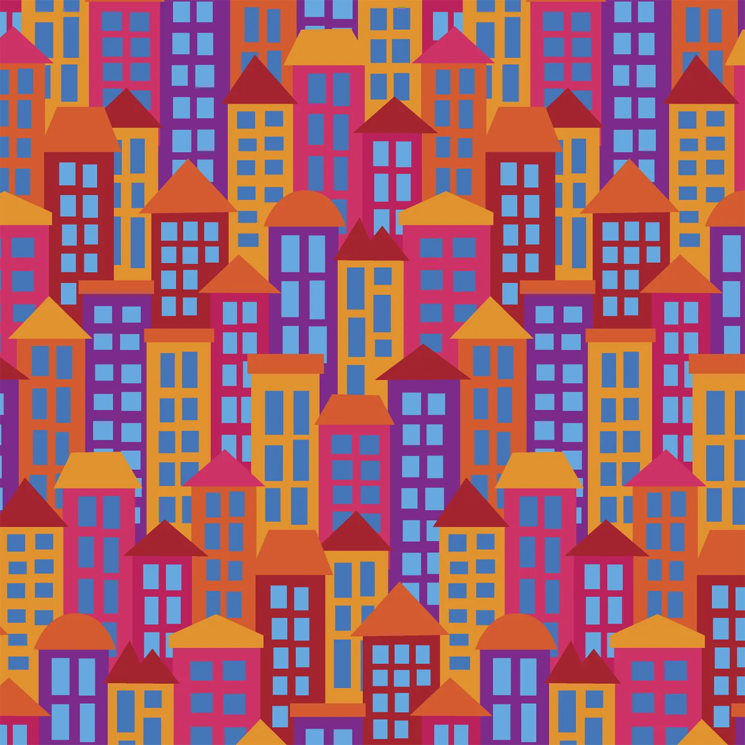
My earlier Homes Pattern Design (see below) was the starting point for Homes 3D. I was looking for a more drama as if viewed by a drone.
Using 3D Settings
It is possible to change the whole pattern by using Illustrator’s 3D and Materials feature. Well that was the easy part. What was much more difficult was to deal with the overlapping shapes and buildings that blocked others behind. I chose 18 buildings and carefully moved each one to look convincing in relation to the others around it. Something an architect would do!
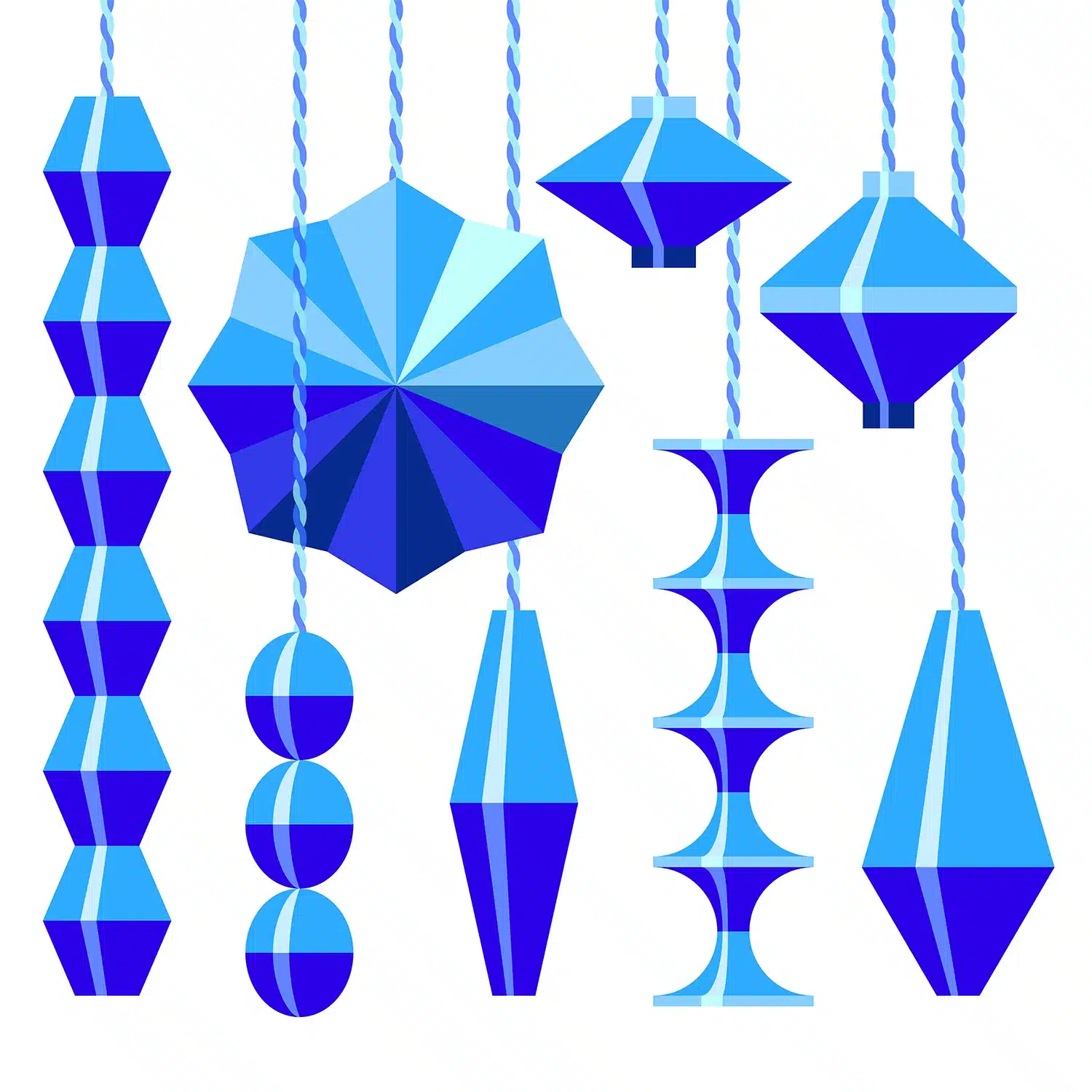
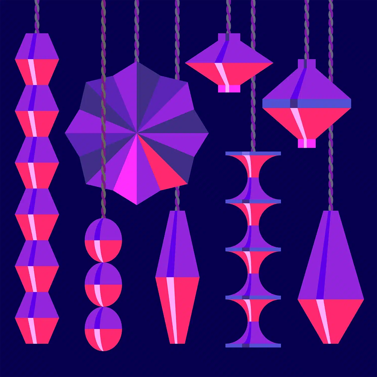
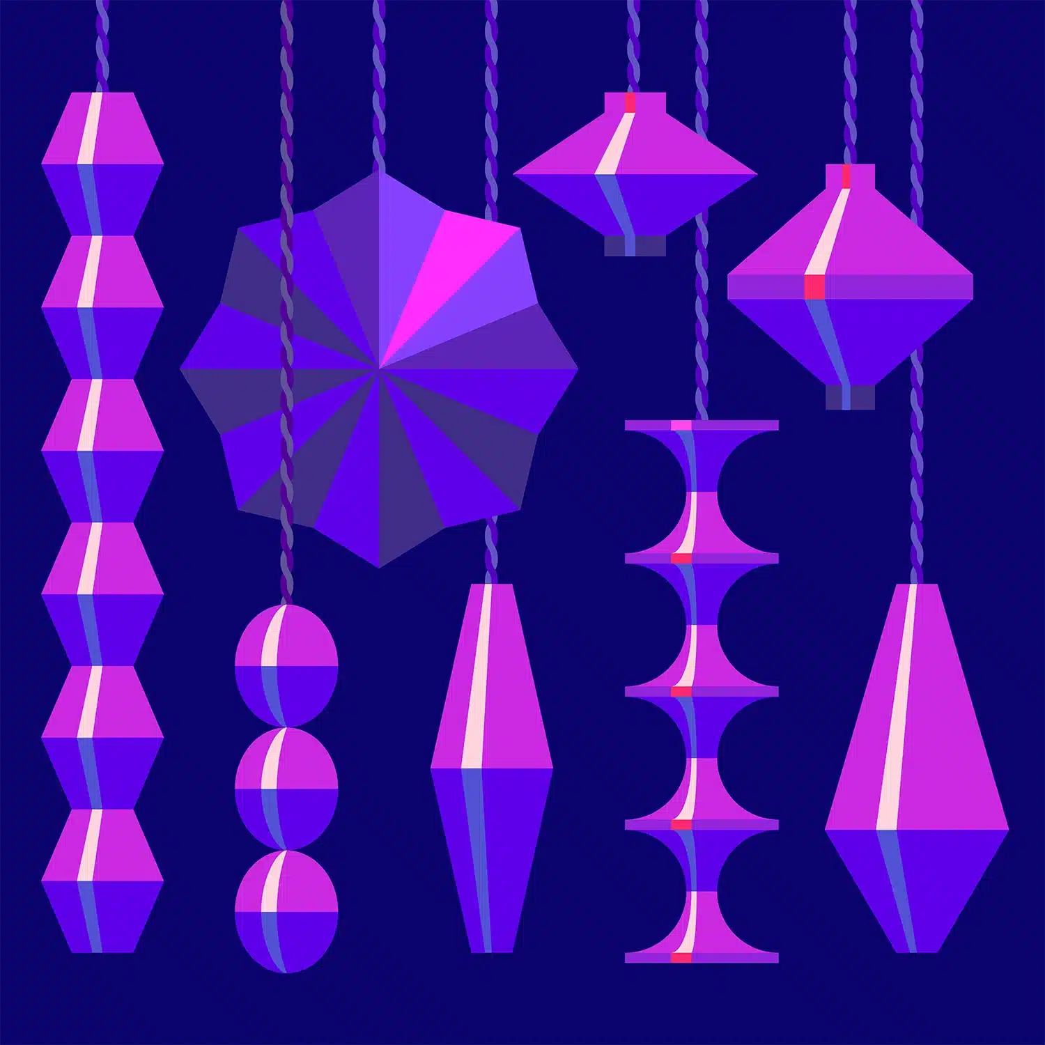
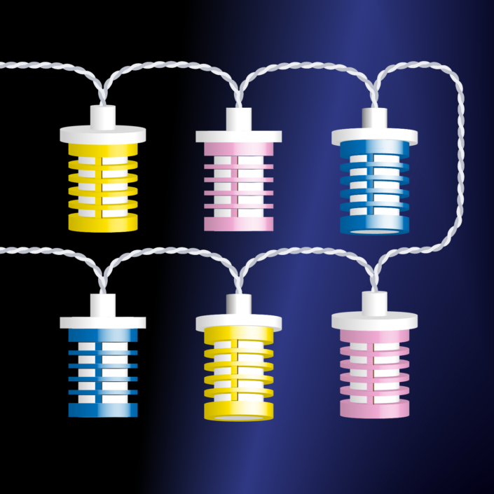
Paper Lanterns
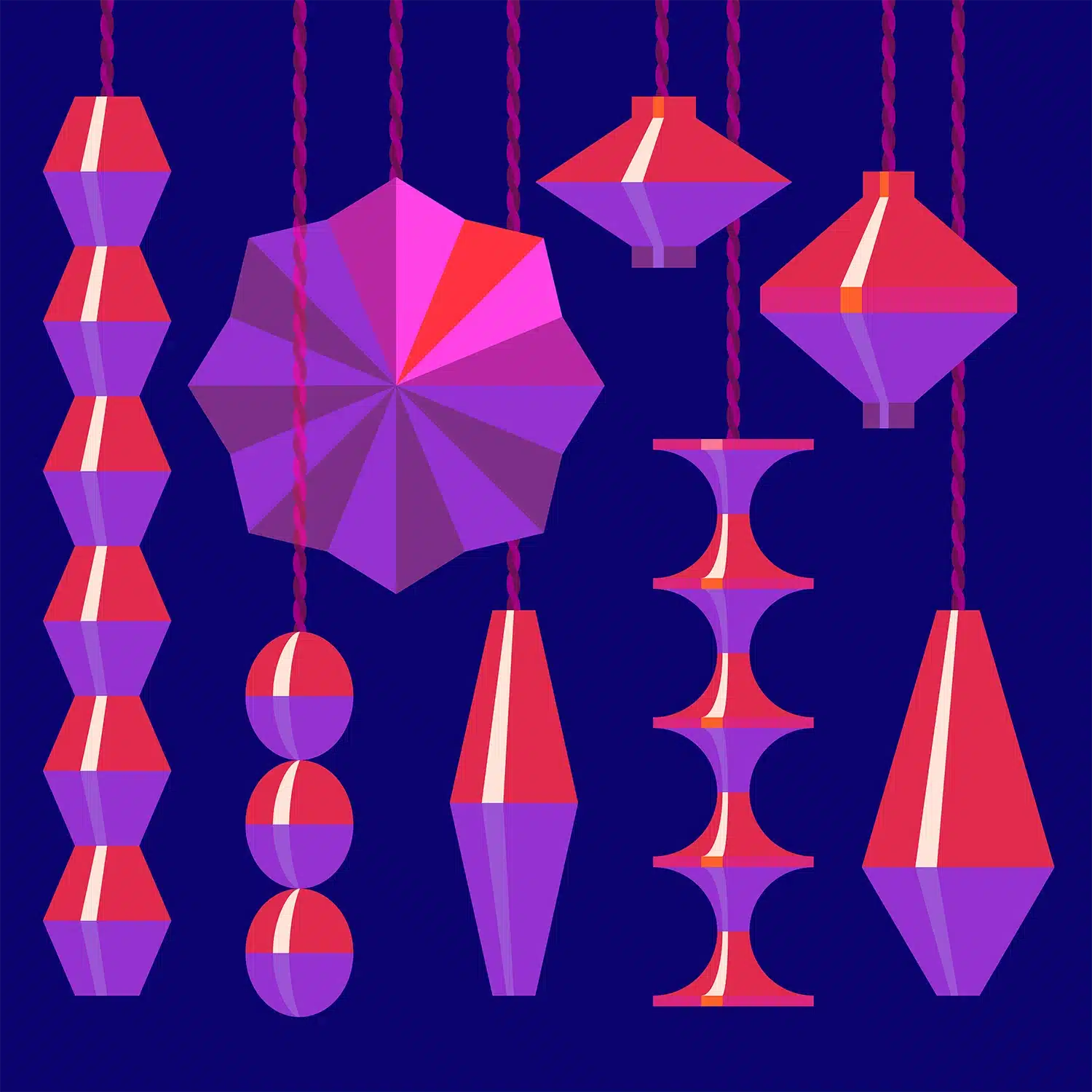
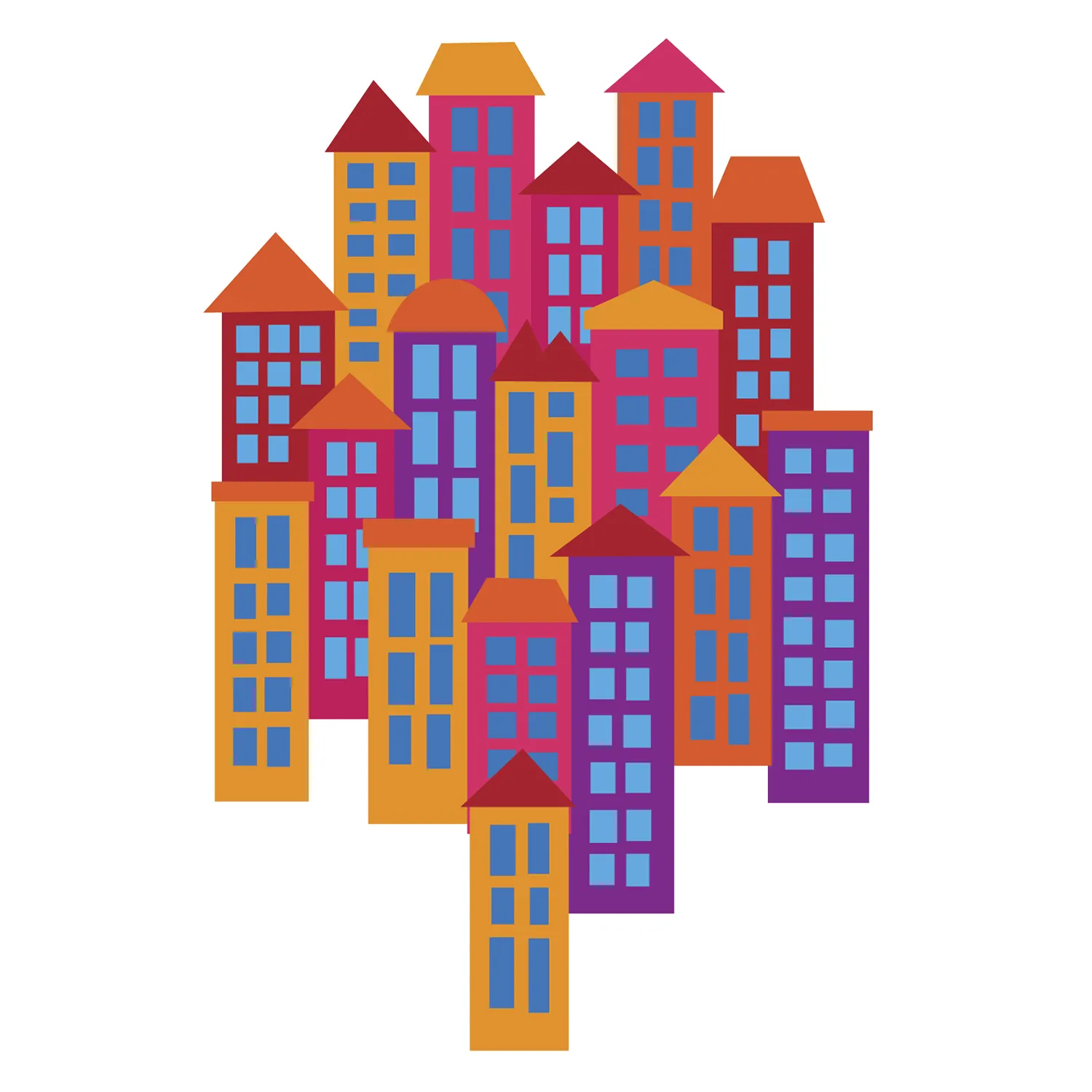
Now clocks have gone back, the days are getting shorter and the nights longer. The perfect reason to create this Paper Lanterns illustration. Do you have a favourite colour scheme?
Posted on Instagram 30 October 2023.
In My Sewing Box
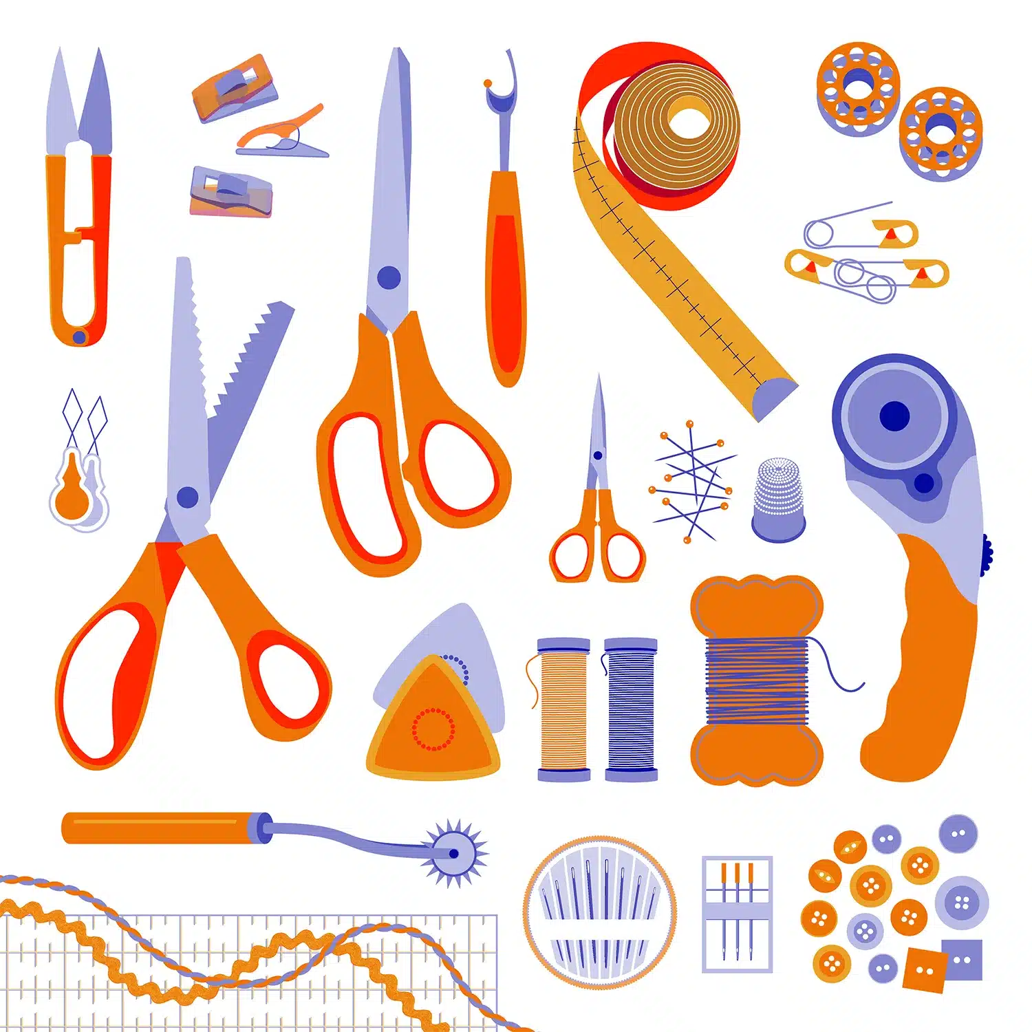
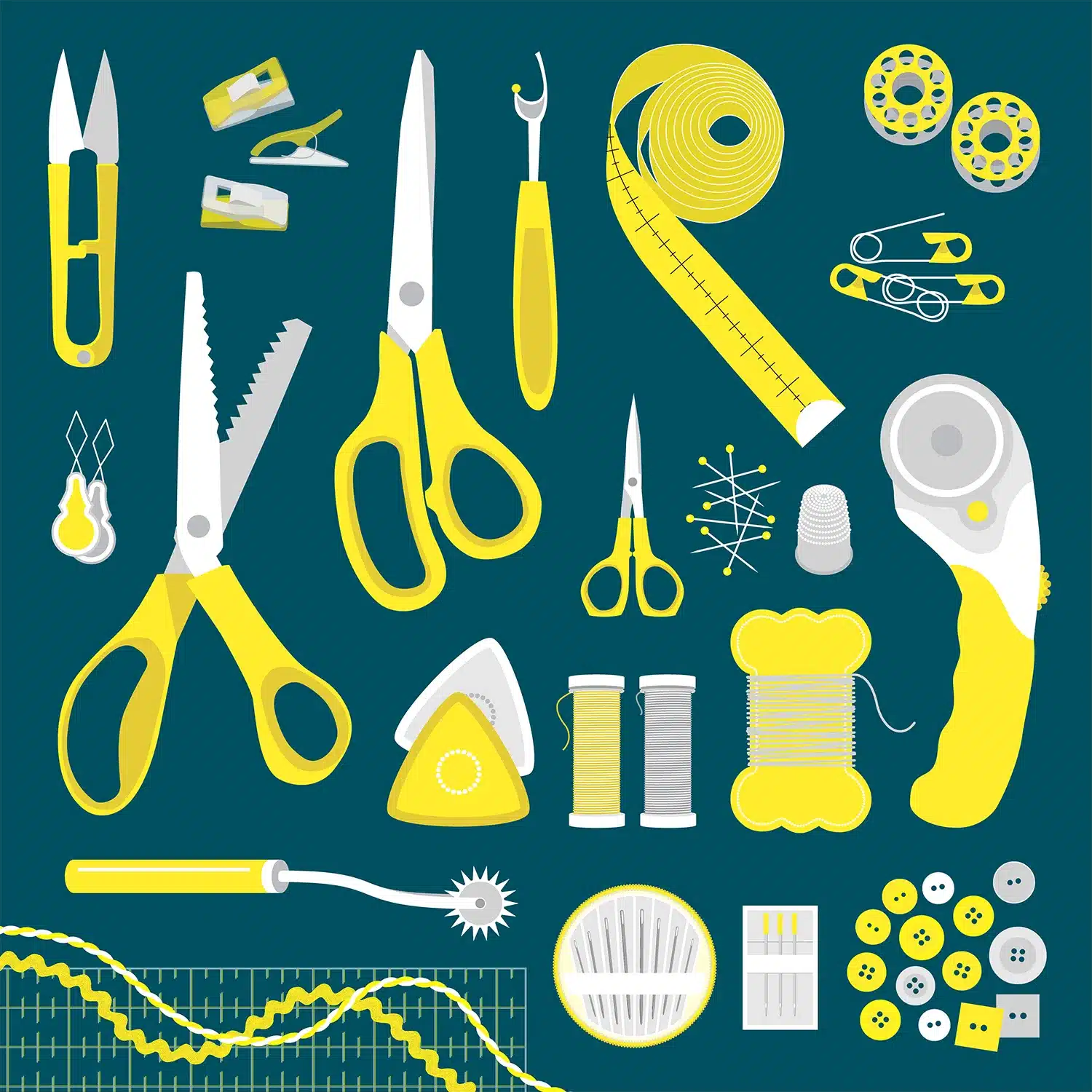
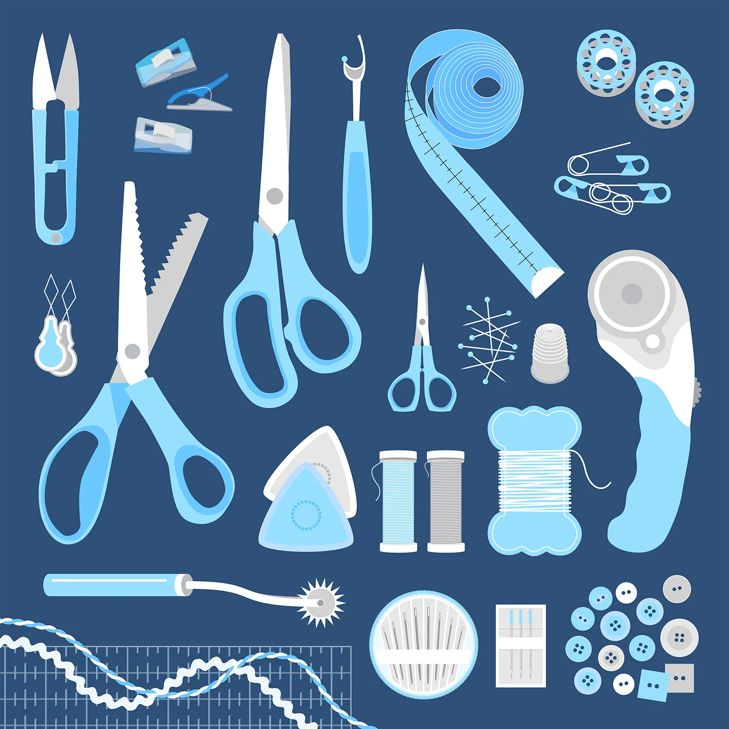
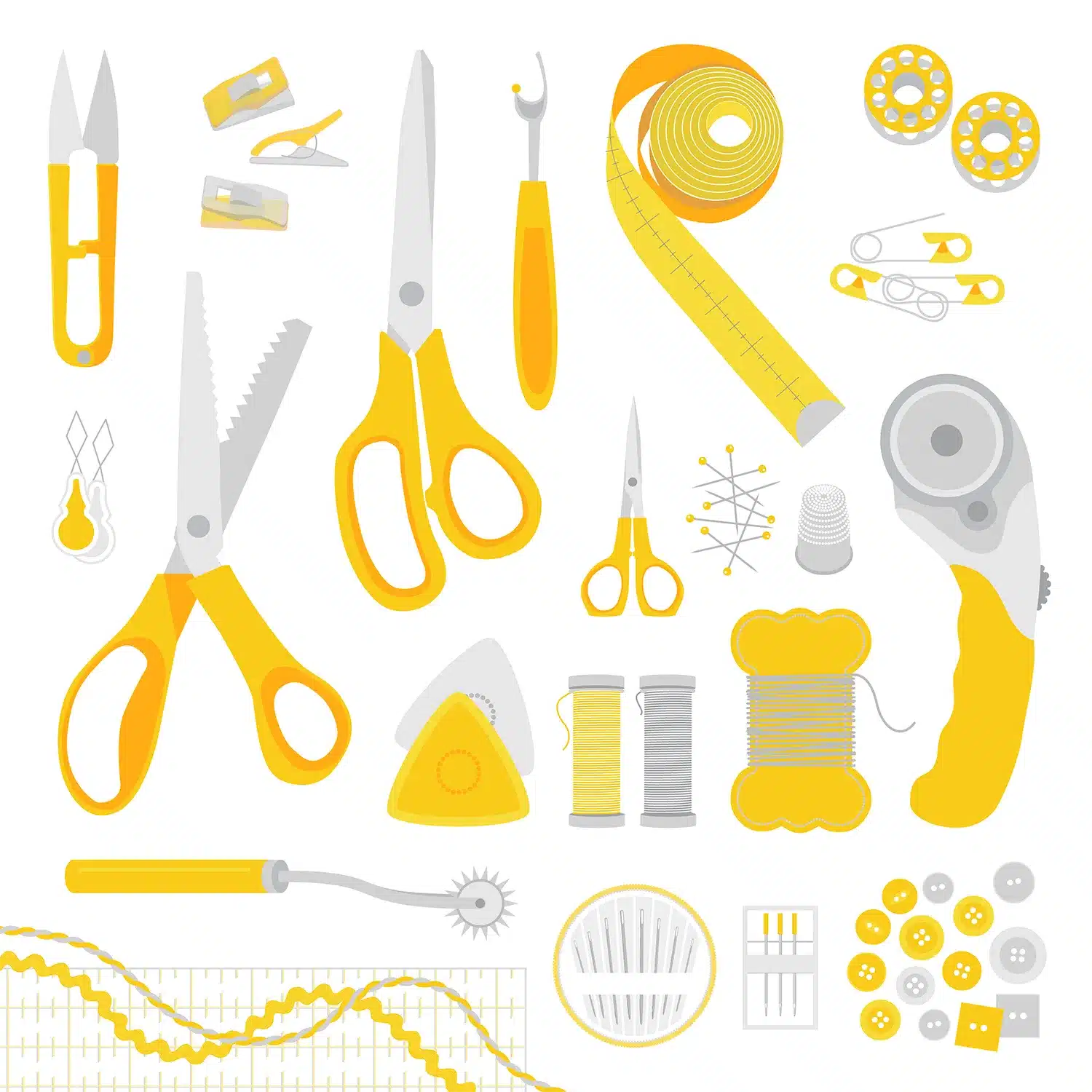
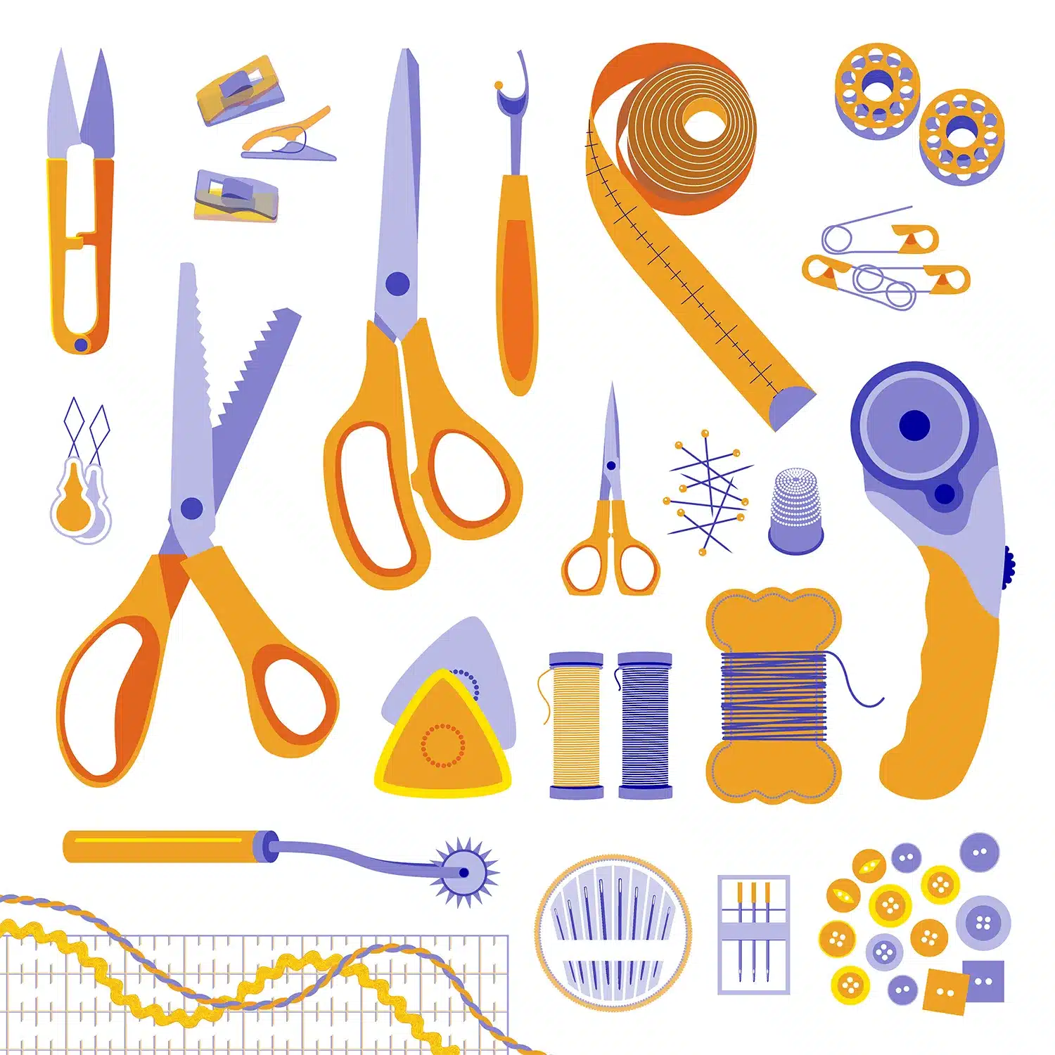
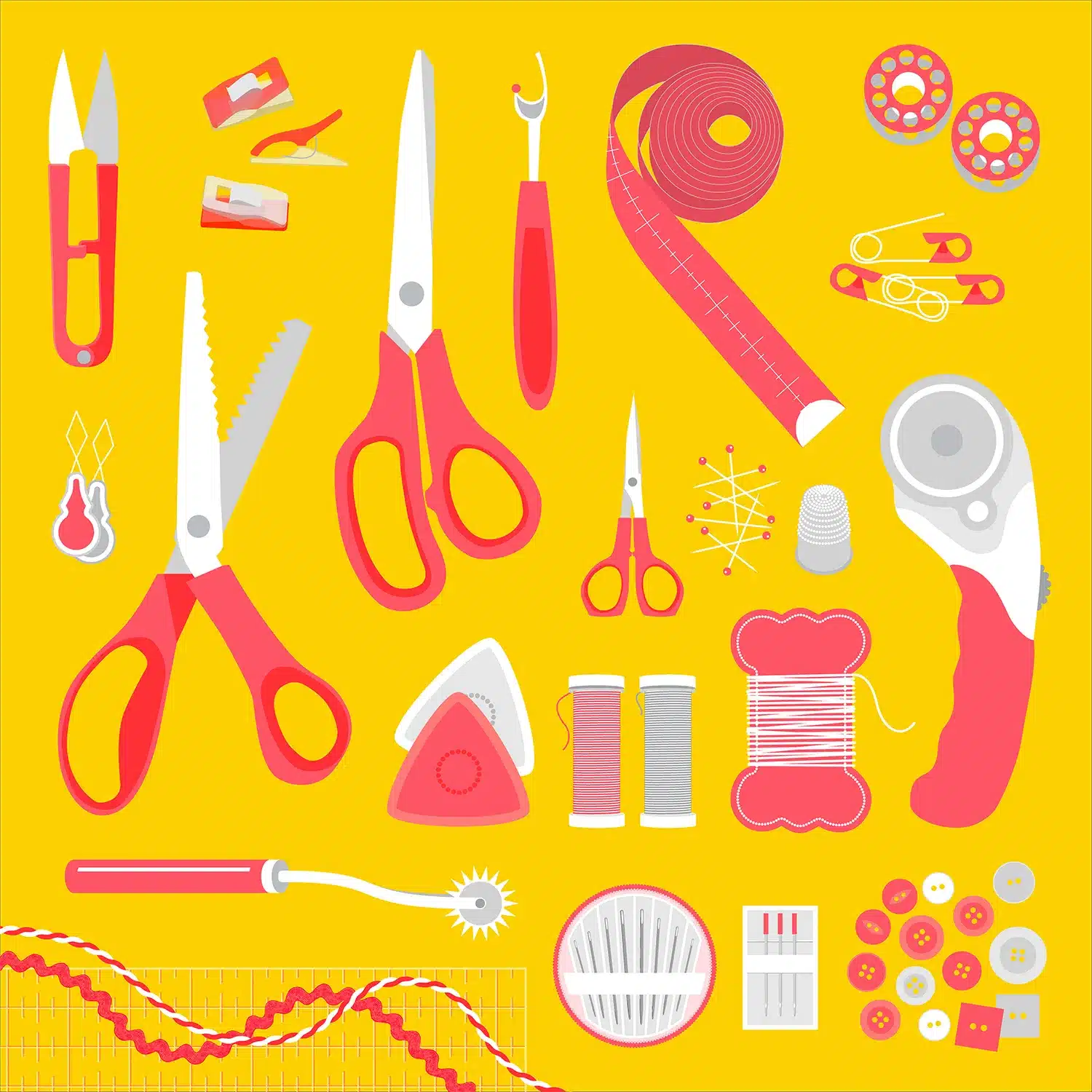
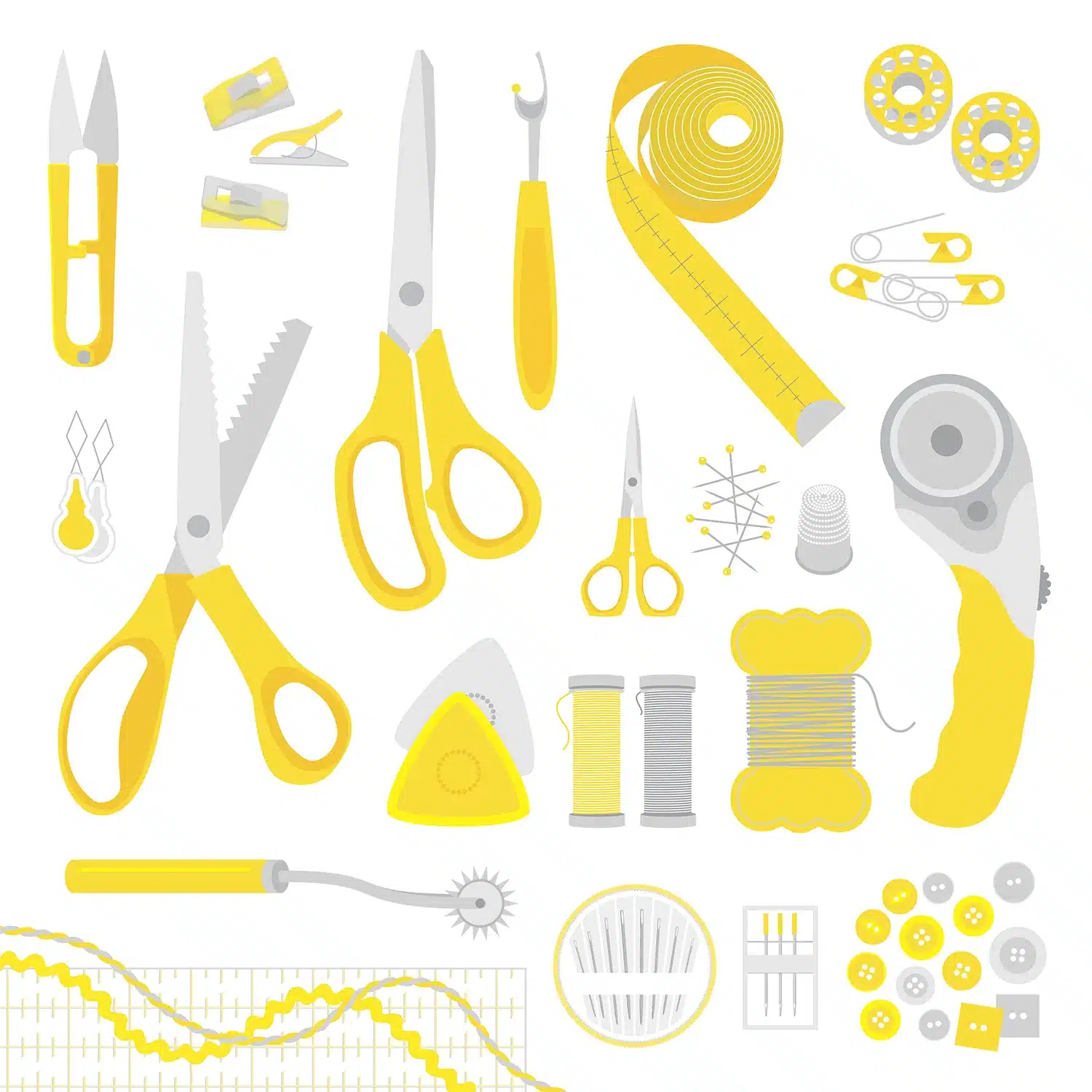
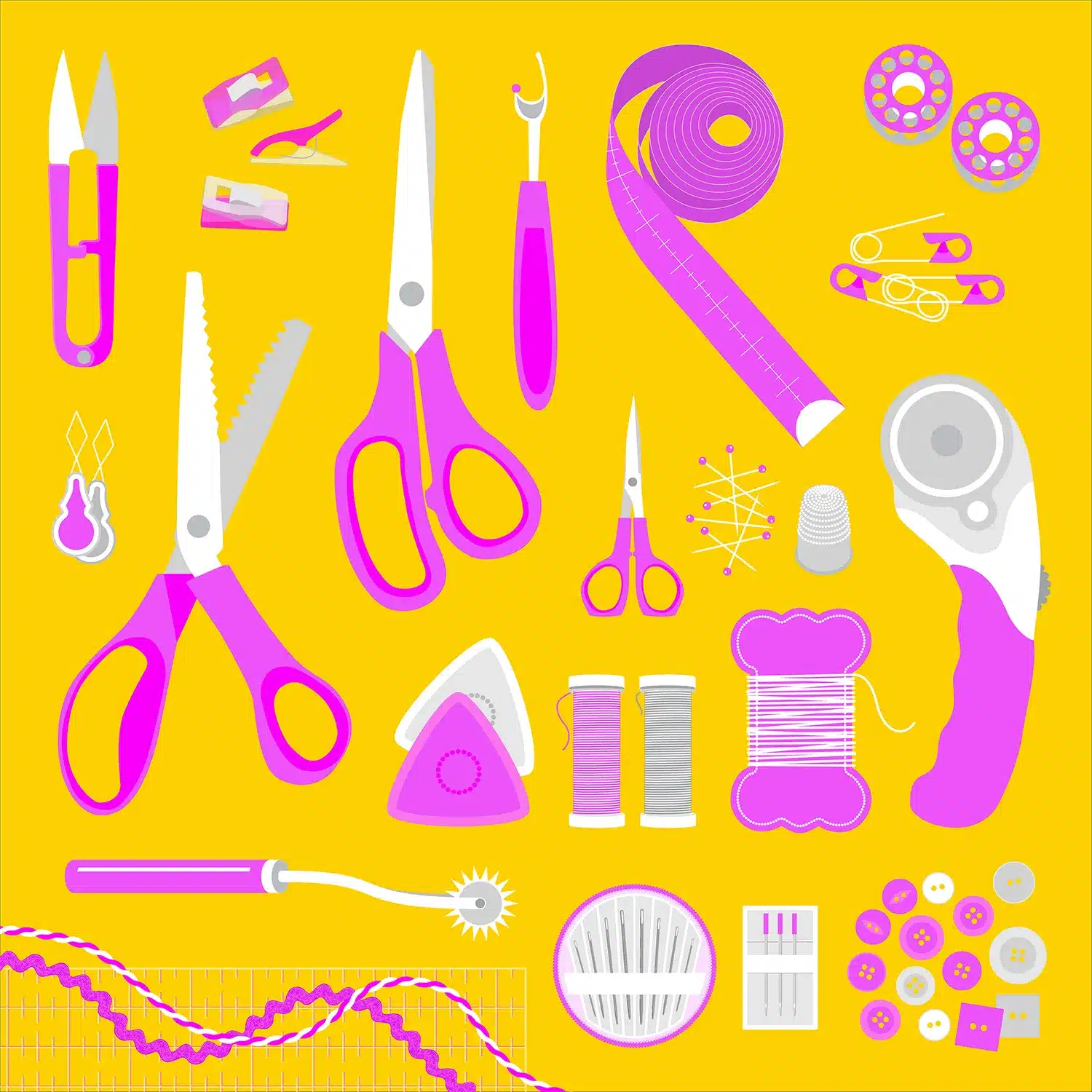
This illustration is based on items found in my Sewing Box. From twisty string to rick-rack, and needles to thread. I wanted to include as many interesting items as possible, especially items like the plastic clips which have become fashionable recently to use instead of pins.
A lot of the items shown have been created from my own pattern brushes. Pins, needles, the lines on the tape measure and the patchwork pattern ruler have all been created using pattern brushes.
First posted on Instagram September 2023.
Grocery Store
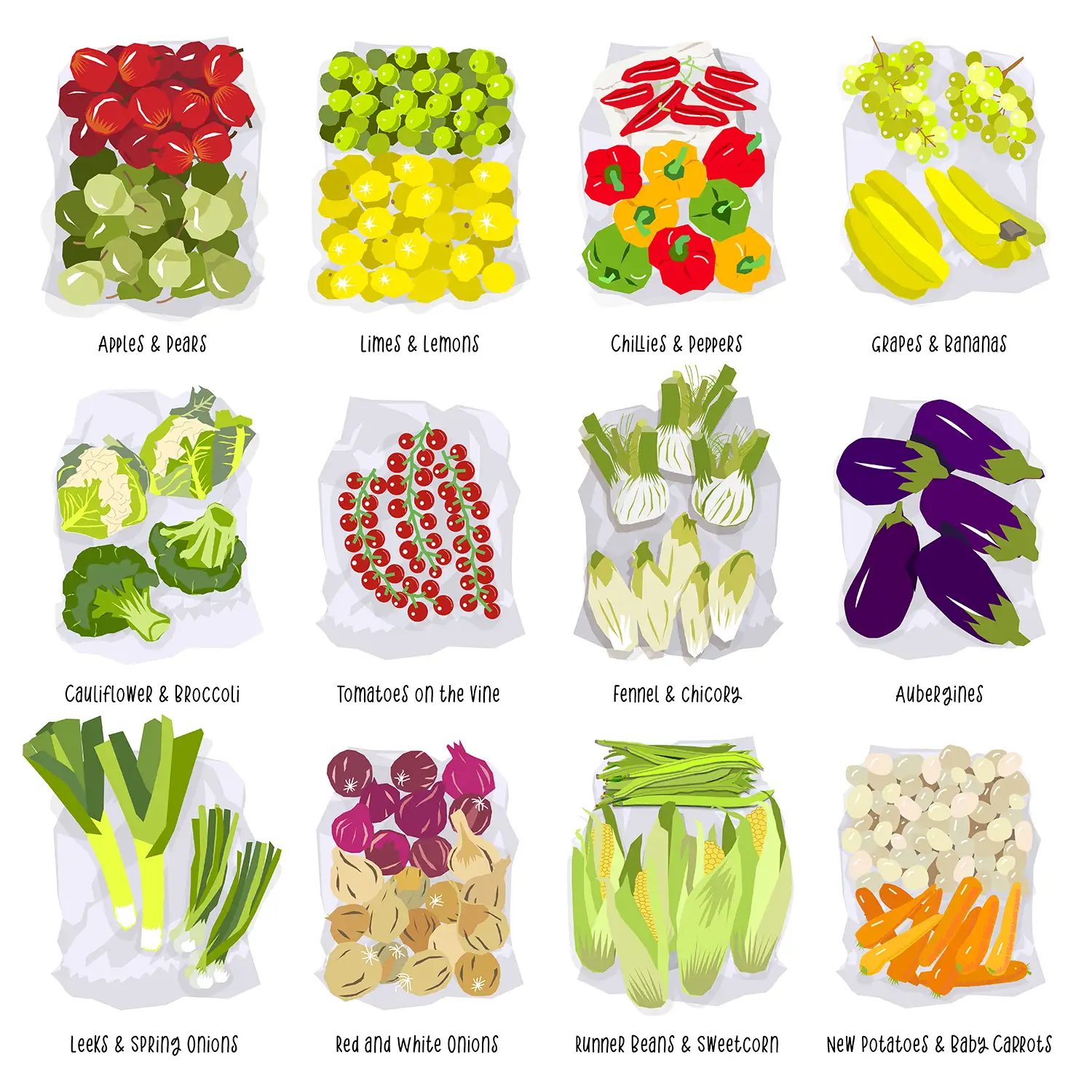
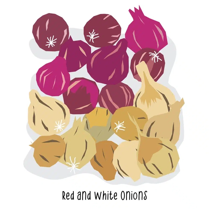
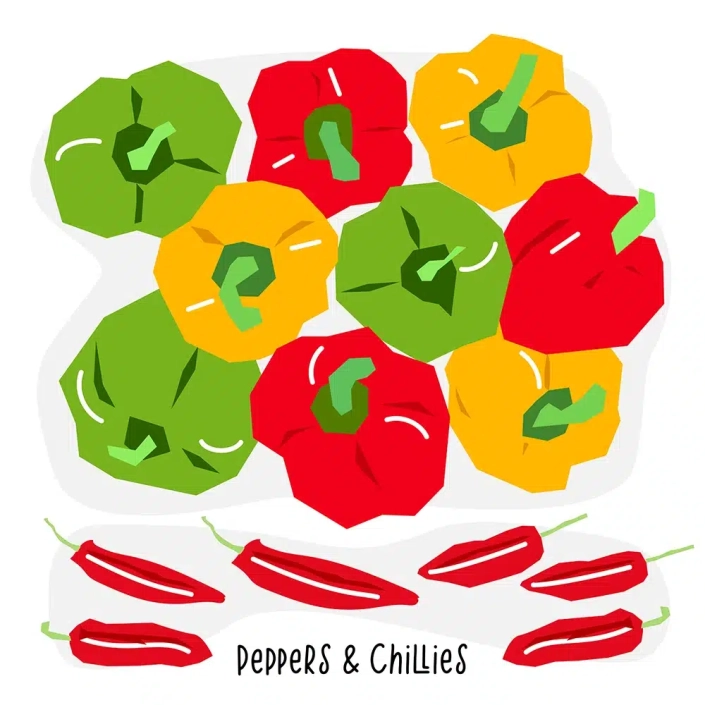
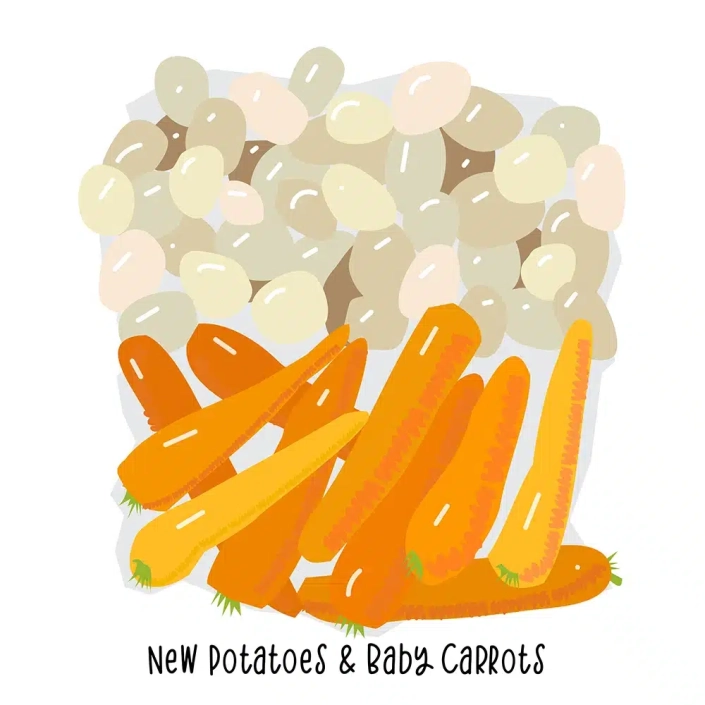
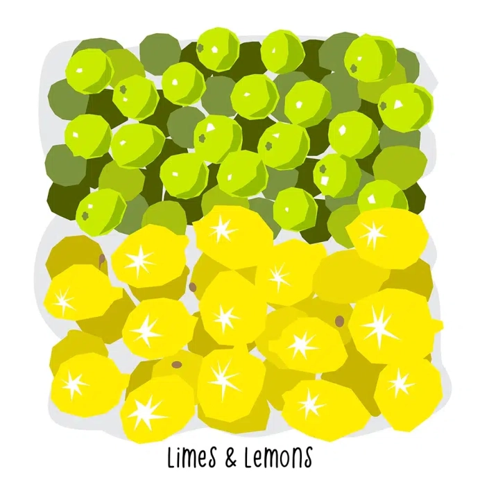
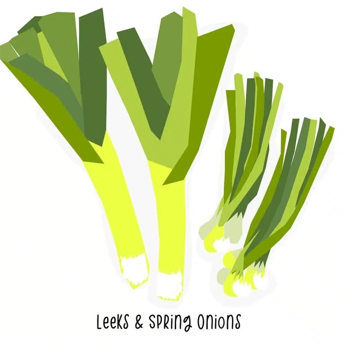
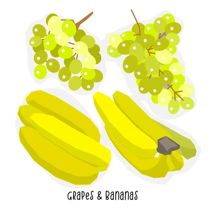
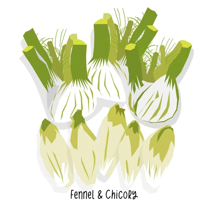
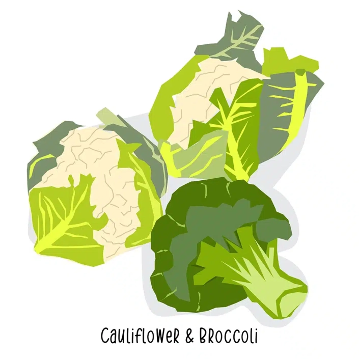
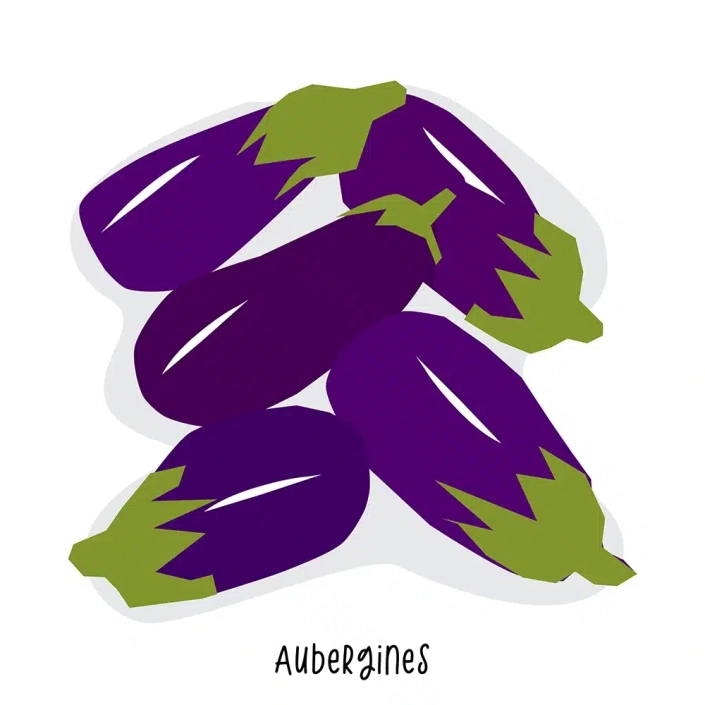
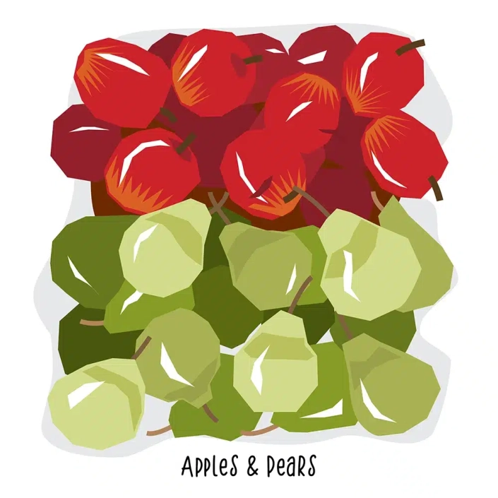
These illustrations were drawn from photos I shot in a local greengrocer’s shop. I wanted to use a fast and simplified way to depict the fruit and vegetables. So in Illustrator I used a series of straight, pen-point paths rather than brush strokes to form the shapes.
The produce is depicted on a scrunched up paper bag.
Grocery Store Panels
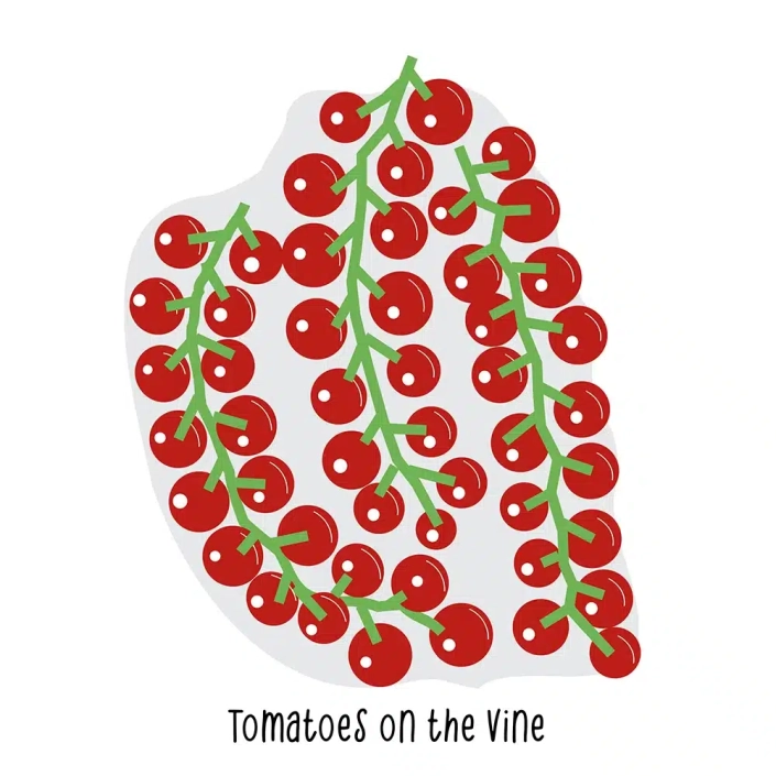
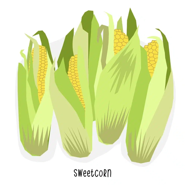
Here are the individual panels that make up my Grocery Store graphic.
The fruit and vetetables are simply shown on a shadow – unlike the combination panels where they are shown on paper with a blue background.
First posted on Instagram August 2023.
House Illustrations
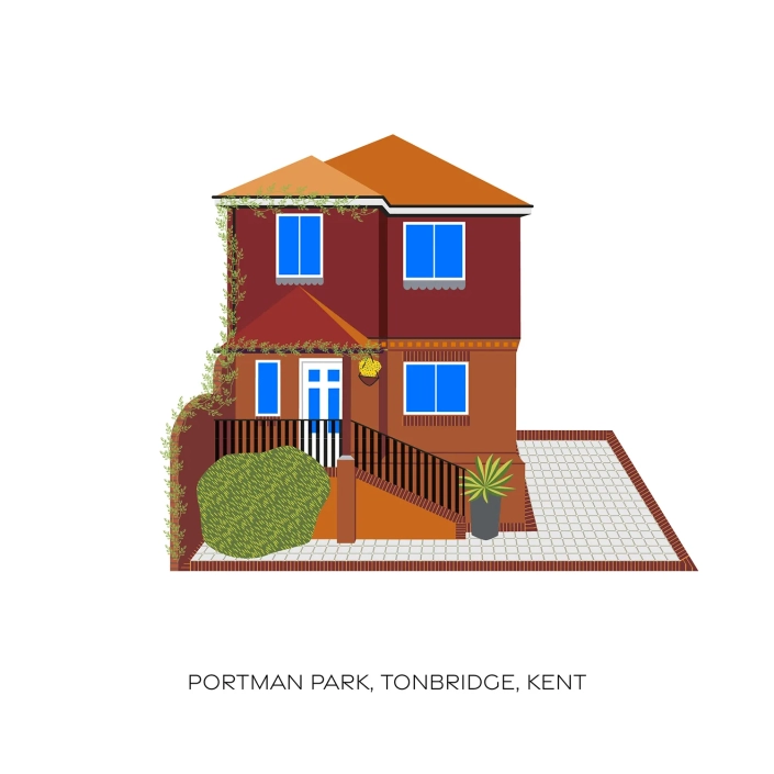
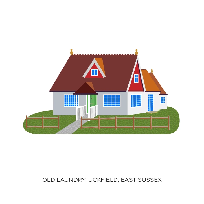
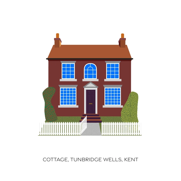
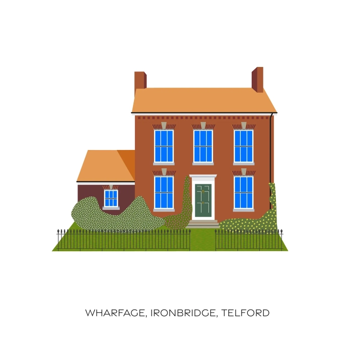
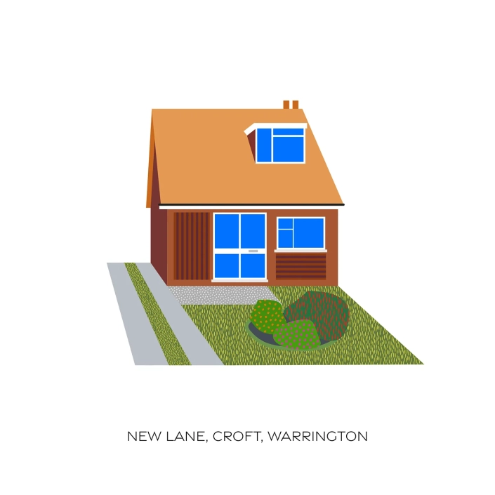
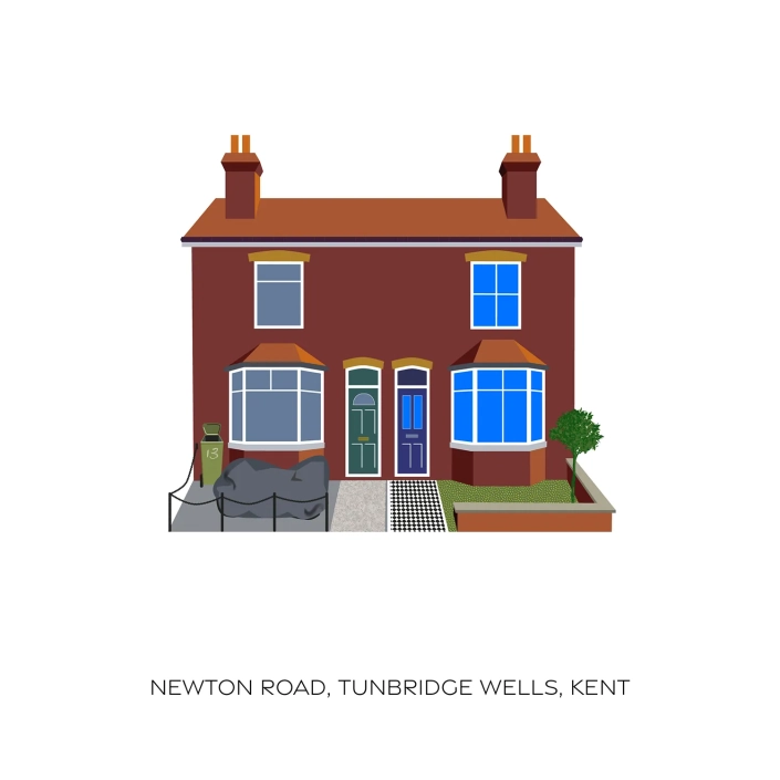
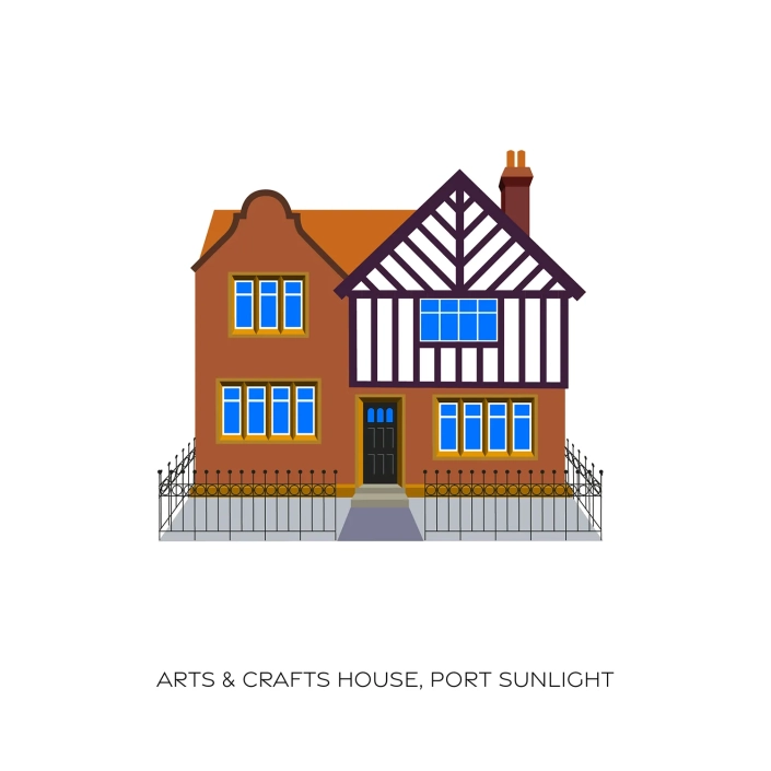
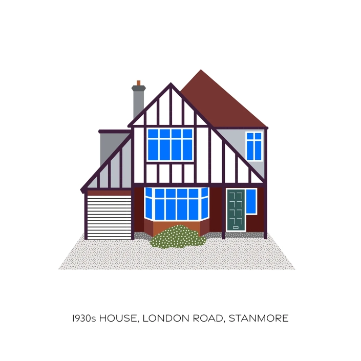
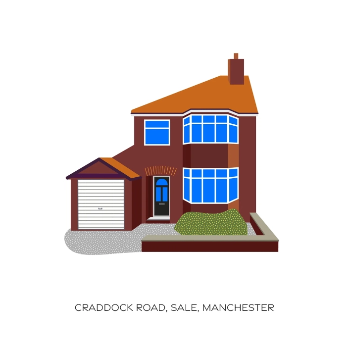
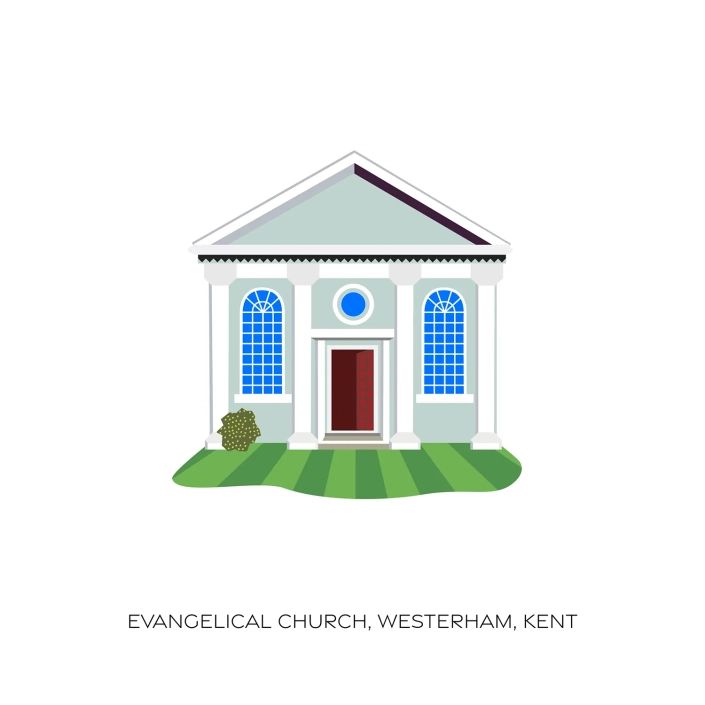
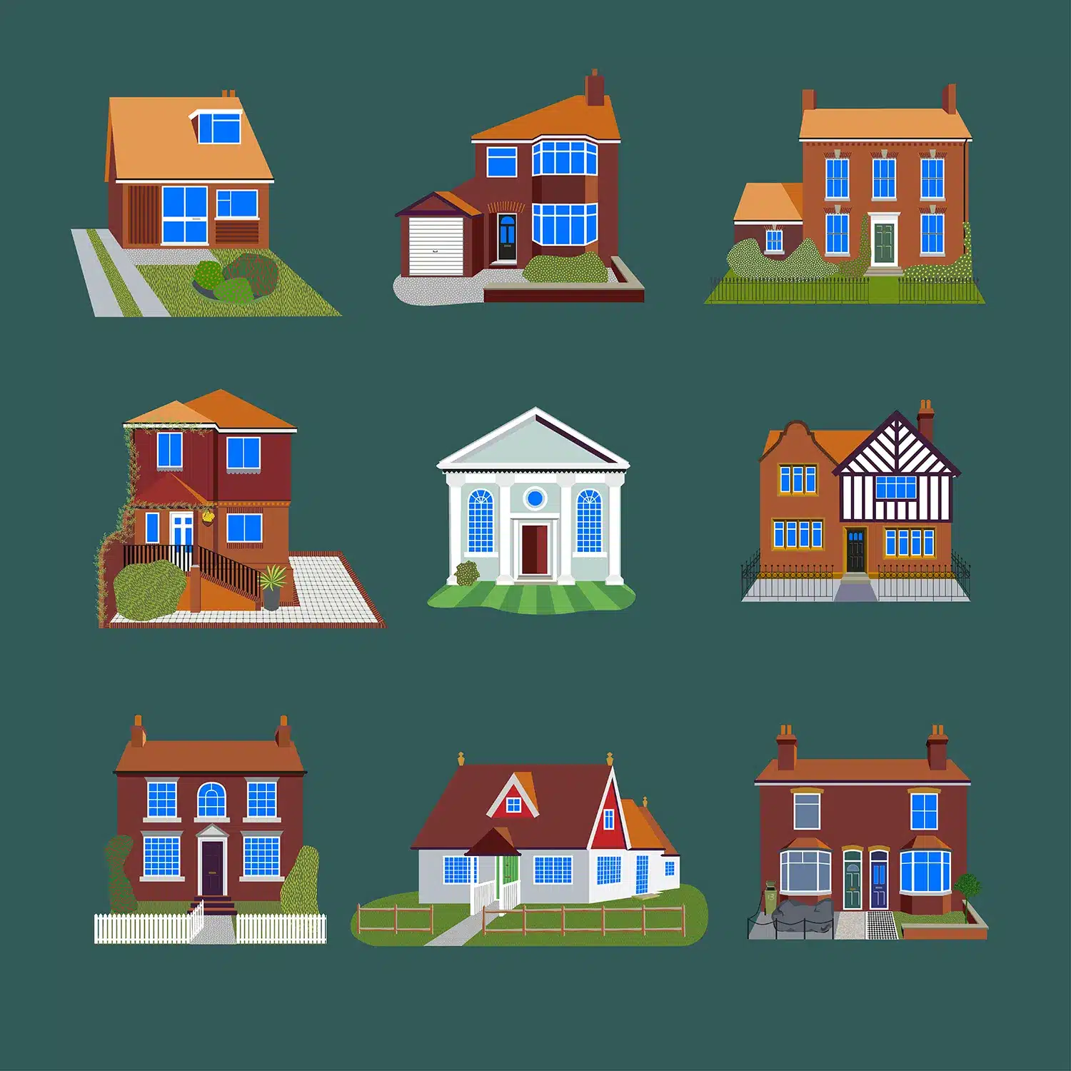
These illustrations celebrate the houses from my past. Some I’ve lived in, others I have simply admired enough to illustrate them. I aimed for each building to be drawn straight-on, so that they could stand in a row and not look out of place. I created stylised patterns for plants, fences and iron railings, often with a more idyllic version of what was there originally.
Home Town Pattern
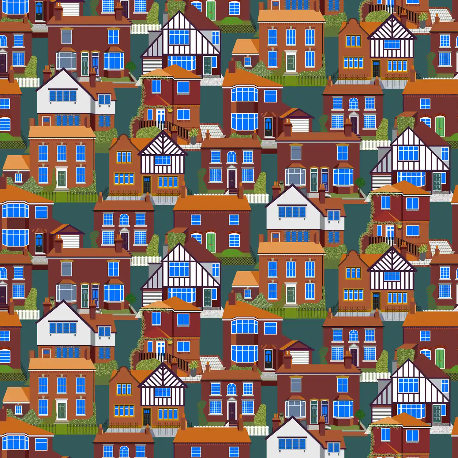
To complete the work on my house patterns I have created a new pattern design using the Homes illustrations. I have named the pattern design Home Town.
Houses Combined
To introduce the house illustrations I created a graphic combining nine of the buildings on a sumptuous green background. All drawn in Illustrator and posted on Instagram 20th July 2023
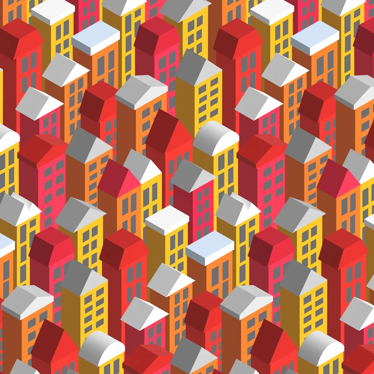
Homes Pattern Design
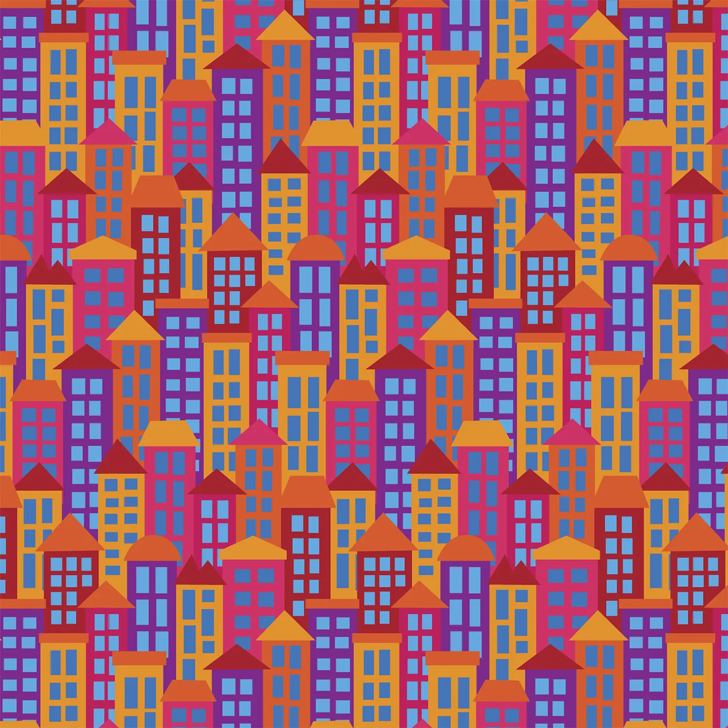
I like the layering effect when you get seemingly random shapes overlapping – especially so with buildings and houses. This pattern uses 17 different buildings stacked behind each other to form the pattern repeat.
Posted on Instagram 16 July 2023.
All Hung Up!
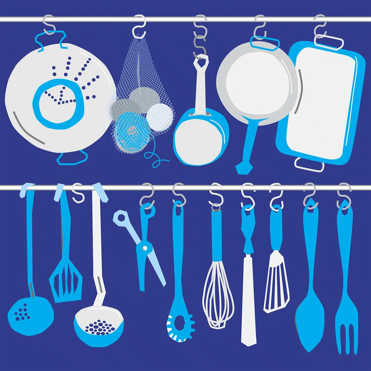
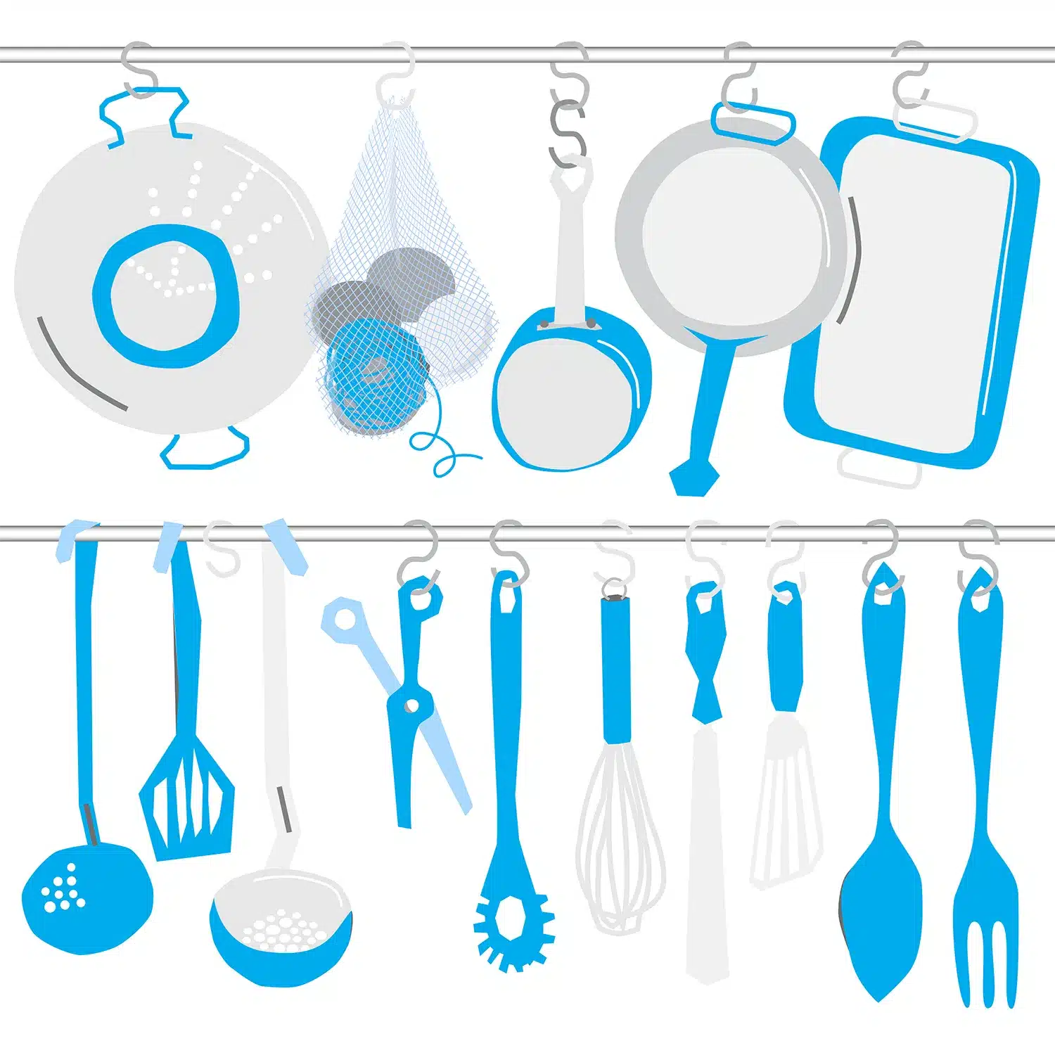
All Hung Up! Ever since my first flat in the 80s I have used some sort of rails to hold up my kitchen bits. This illustration was created using my own reference and made up ones. I have experimented with different coloured backgrounds and changing handle colours. See my instagram page for other colours and my current kitchen with items hanging from peg rails.
Watering Flowers Collage
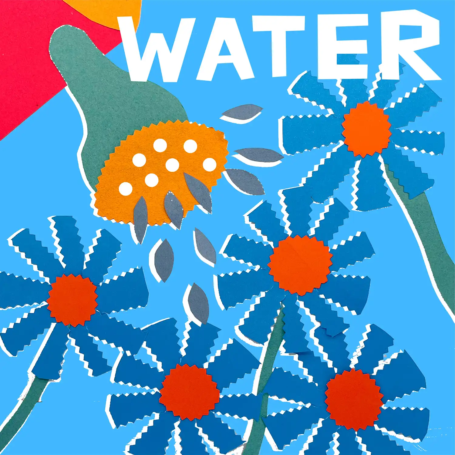
After finding an old box of coloured papers in the loft I created this collage. Starting with just the flowers with pinking shears I added the watering can and droplets. Next I photographed the collage and added the hand made text in Illustrator. The final touch was adding the white miss-registered under-layer. Featured on Instagram in July 2023.
Do It Yourself Tools
Following on from the success of my design Under The Sink, I was looking for another collection idea and do it yourself tools seemed a fun theme with lots of interesting shapes. From the outset I envisaged the design on a relaxed pegboard grid. When all the tools were added to sit vertically the design was a bit lifeless, so angling the all the tools at about 15 degrees added vitality. At first I tried also angling the pegboard grid but that was too much, so the pegboard remained roughly vertical. Posted on Instagram in August 2023.
Under The Sink
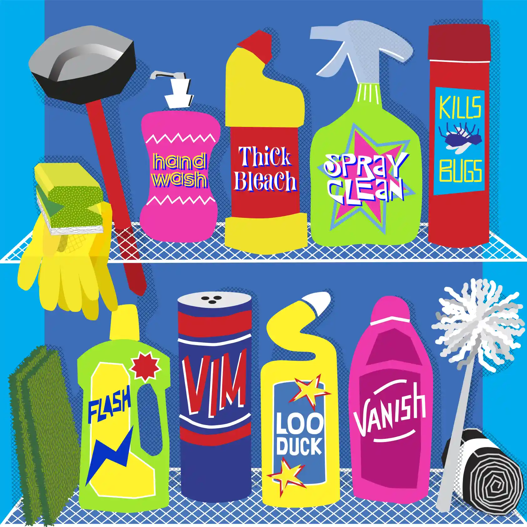
I created this imaginary scene by including a variety of iconic brands and recognisable shaped bottles and containers. Using wobbly type and uneven edges I designed two shelves of kitchen essentials. The rough shadows are created from one of my cross hatching patterns. The design was first posted on Instagram in July 2023.
God Save The King
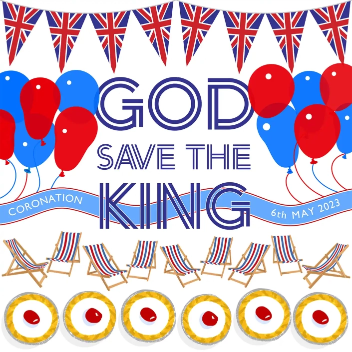
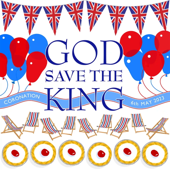
For the King’s coronation in May 2023 I created a new pattern design called Bunting. One of the variations was a series of patriotic Union Jack flags. I had previously created patterns for balloons, deck chairs and even cupcakes so the nice project to assemble them into posters.
I couldn’t decide which font to use for the slogan so here are the two I finally posted on Instagram, on the big day.
Wiggling Wires
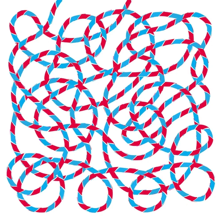
While experimenting with ideas for Christmas tree lights I got distracted with another idea of wiggling wires made of different colours. There are a series of different styles from slabs of colours to the most dramatic one where the diagonal slices of colour are out of line giving the appearance of more movement.
Posted on Instagram 2 November 2023.
Tablet Shapes
For this illustration I used just three simplified drug shapes; lozenge-shaped capsules, circular tablets and paracetamol-style caplets. I experimented with transparency and blending settings to make the other drugs slightly visible through the capsules. I started with the correct colours of the capsules, but in the end preferred the minimal palette of blues and greens.
From this original artwork I developed my pattern design called Capsules.
Melaware Advert
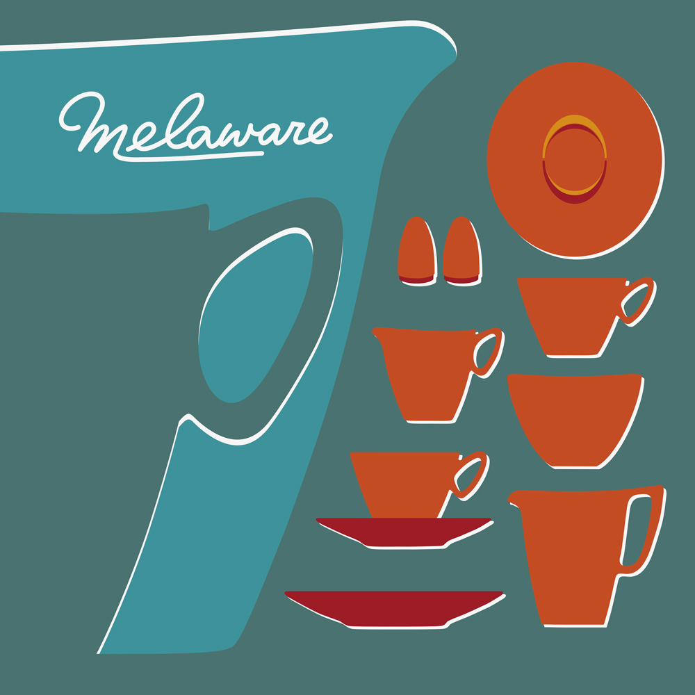
Melaware takes me back to a caravan my aunt and uncle had in the 1970s. The colours they had were simple red with white inside. Years later my collection of Melaware is much more diverse. My favourite is the rich teal colour used here for the background of this imagined advert for Melaware.
I photographed each of the pieces as a starting point to create the shapes. Two large jugs were added on the left. Making one jug paler gave a space to float the logo copied from the bottom of the cups.
Old-Style Lightbulbs
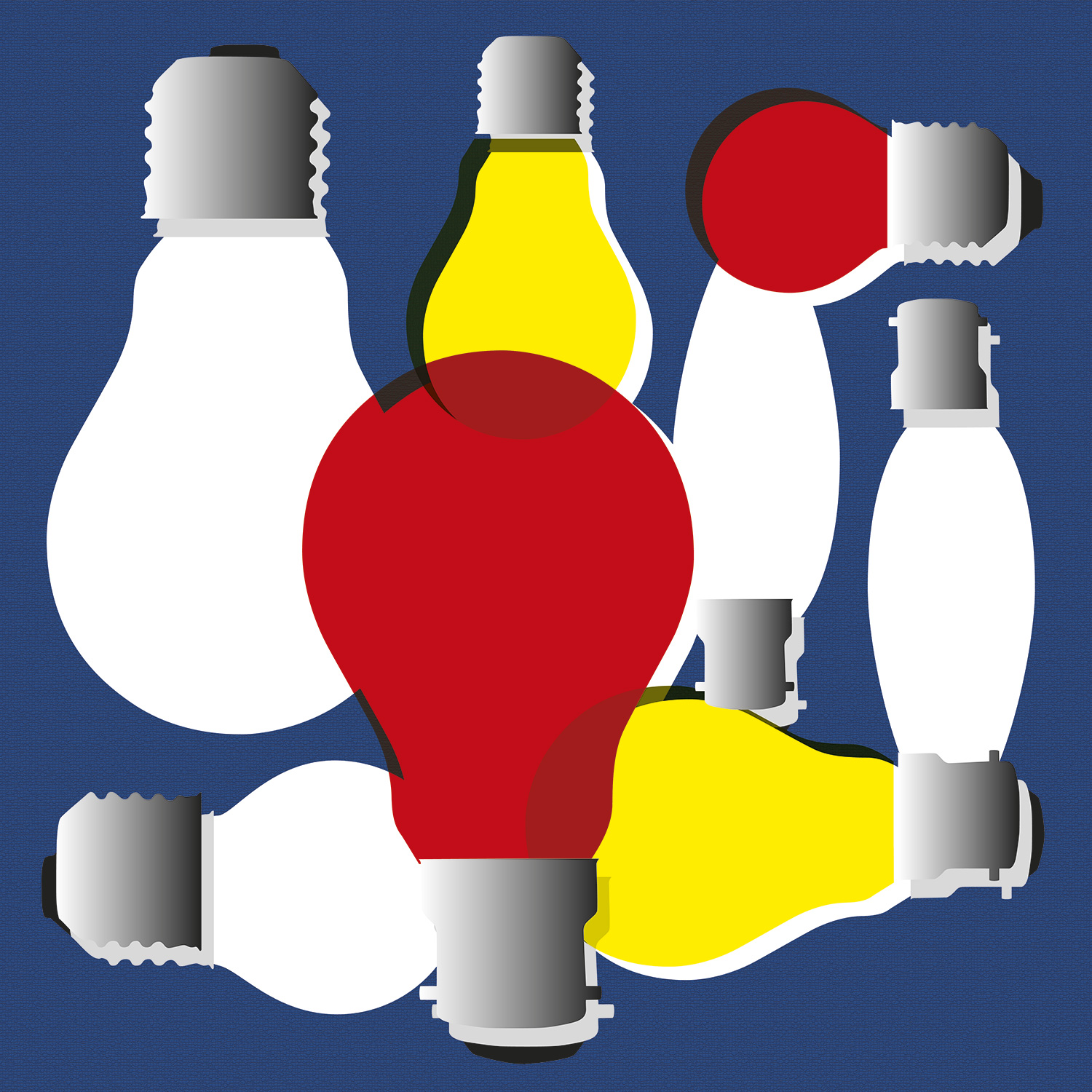
Soon to only be seen in museums, these BC (bayonet cap) and ES (Edison screw) bulbs use inefficient filaments and are now being phased out. The red bulb is one that used to live under the fake coals in an old electric fire.
I wanted the illustration to feel like a badly printed magazine advert from the 1960s, so made the colours of out register. The blue background has a slight texture to emulate course newsprint.
Balloon Dog
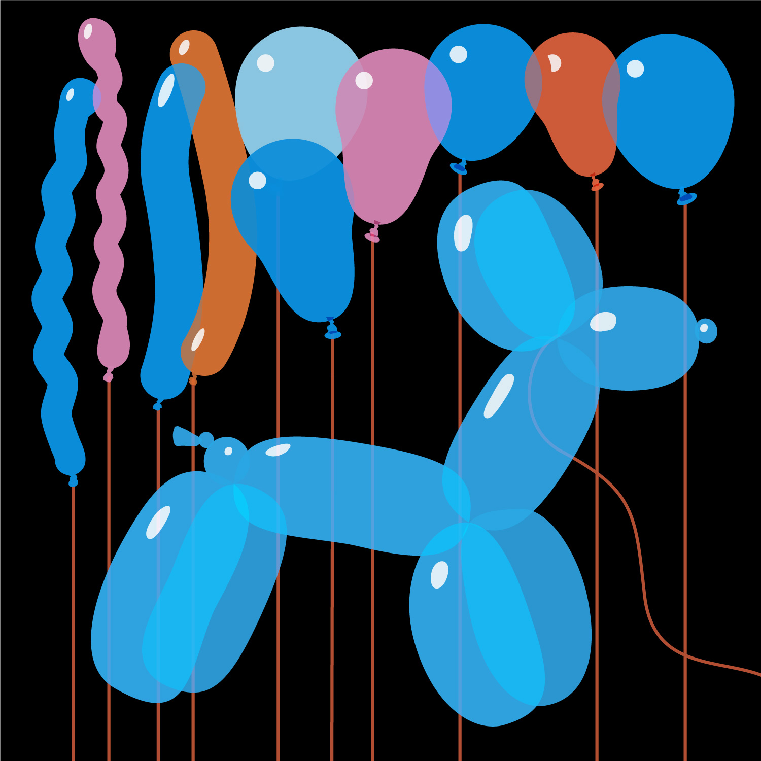
Inspired by Jeff Koon’s balloon dog sculptures. In contrast to his solid shiny shapes, my balloons are more realistic being semi-transparent, where it is possible to see though to the balloons behind, as well as the strings in the background.
I tried other balloon shapes, but felt the more classic-shaped ones like the thin twisted ones worked the best.
Fireworks
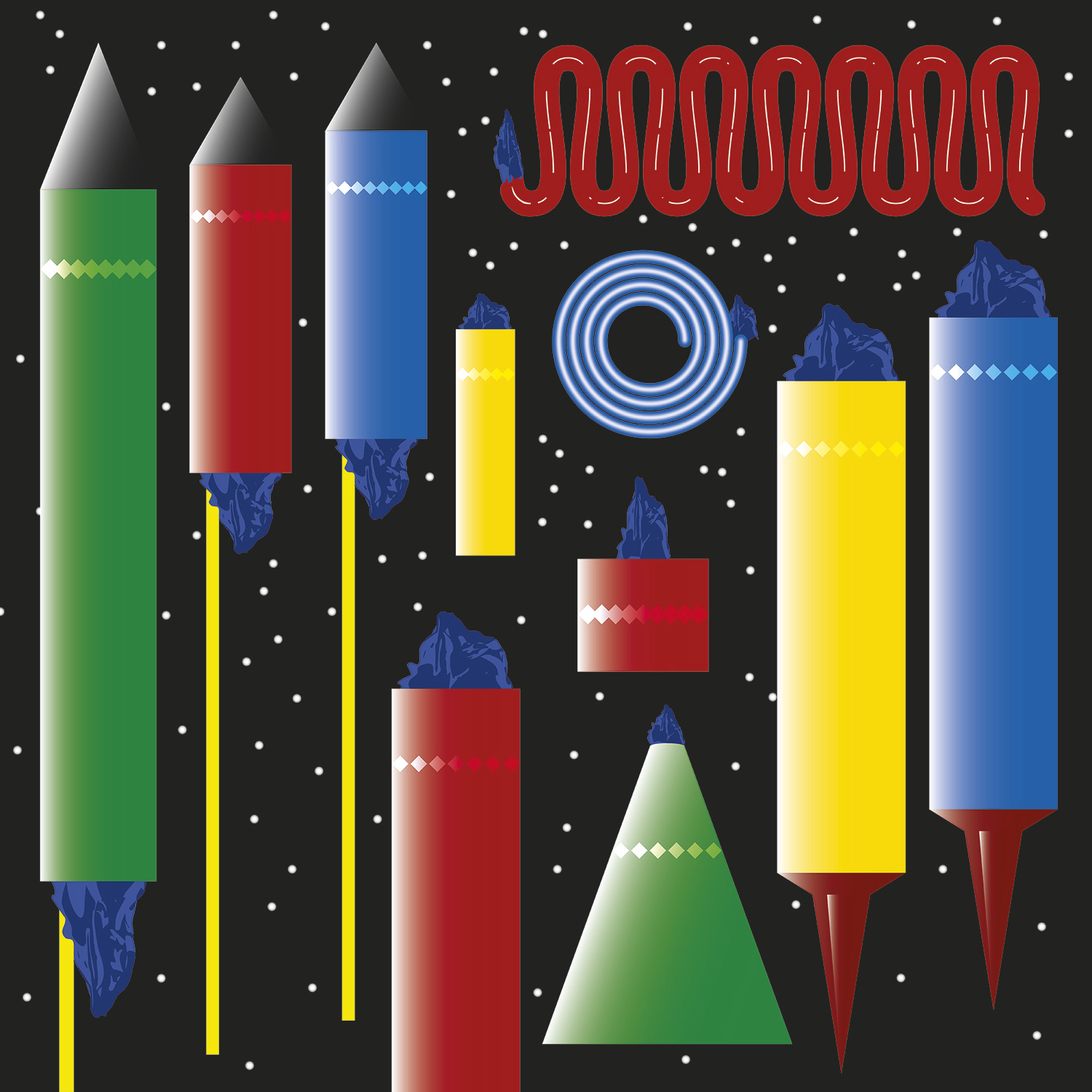
Inspired by boxes of sulphur-smelling fireworks from my youth. In my early teens my parents had a village shop. I remember the excitement of having a bonfire, eating spicy parkin cake and setting off the fireworks that hadn’t sold in the shop.
The illustration shows rockets, Catherine wheel, Roman candles and Firecrackers, all on a starry black Guy Fawkes background.
Winner Medal
I picked up this little plastic winner’s medal for 10p at a boot fair. I loved the stripy ribbon which at the time was looking pretty grim. After a wash and iron I spent a fun afternoon experimenting with the how to depict the ribbon and drawing the wobbly souvenir.
First posted on Instagram September 2023.
Fairy Lights
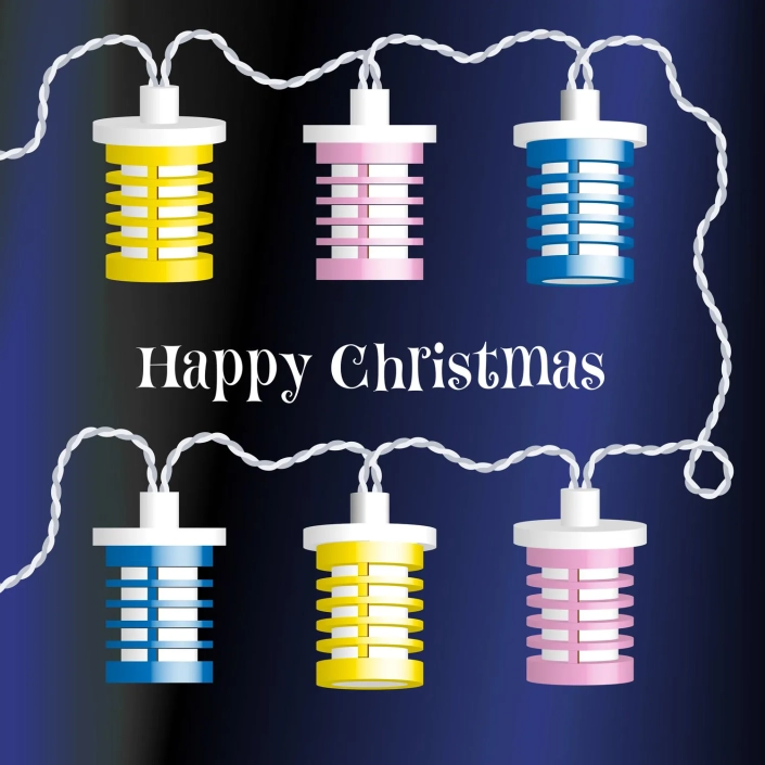
When I was a toddler my dad made his own Christmas tree. He was so proud of it he shot lots of slides of it. 55 years later I had all his slides scanned, meaning I had really good reference to draw these lantern-shaped fairy lights from the 1950s. To top all of this I found the very same fairy lights for sale at an antiques market – a much treasured find!
This design was altered for Christmas 2019 making the wires more wobbly and adding the fun Happy Christmas message set in P22 Festiva.
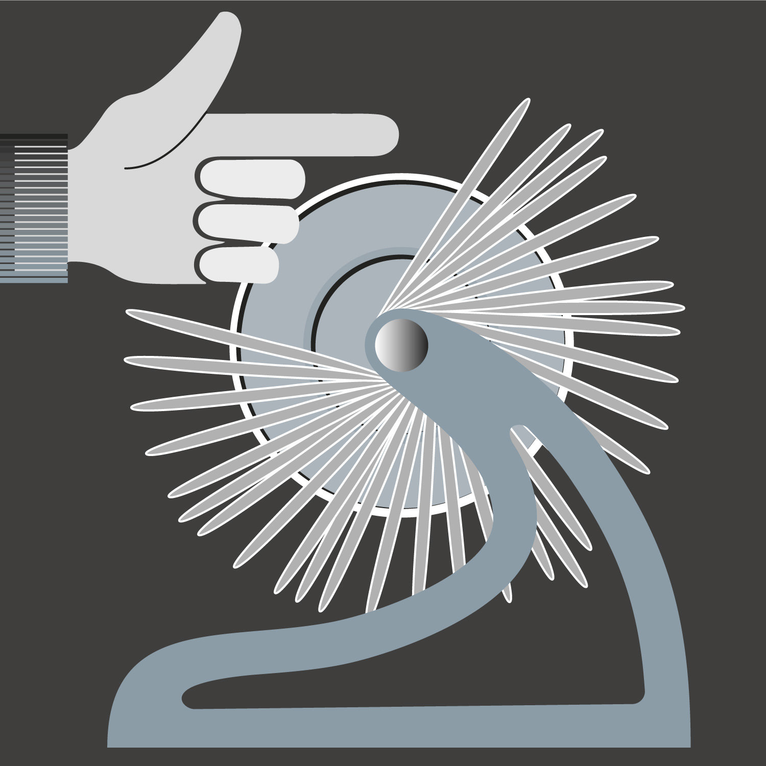
Rolodex
Once often seen on most desks, the Rolodex stored alphabetical information cards on a rotating file.
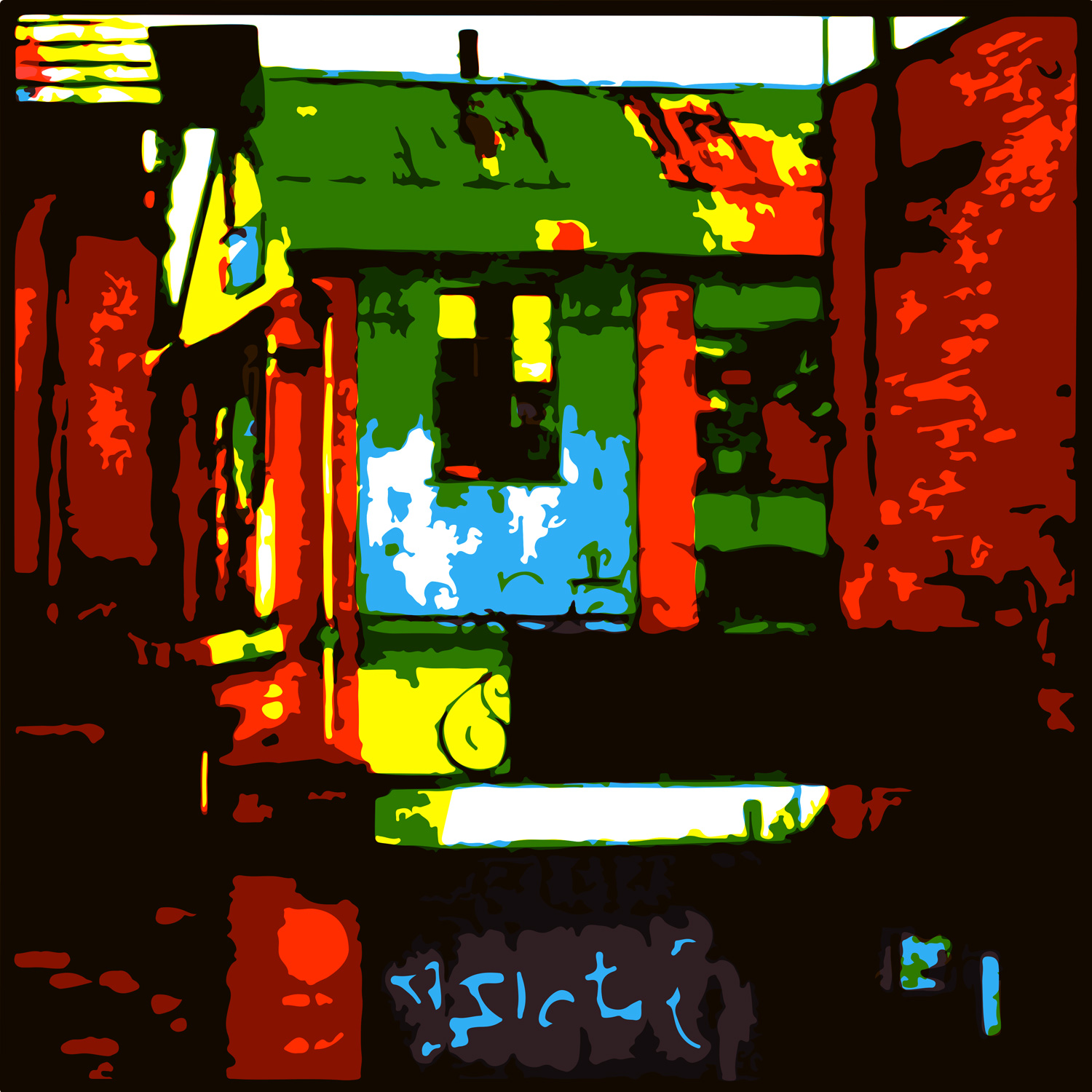
Development Potential
Taken from a photograph of a wonderful builder’s yard, before it was demolished to be replaced with a housing estate. To give the impression of a screen print I replaced all the colour shades with flat colour. Then made the image extra punchy by using simple bright red, yellow, green and blue.
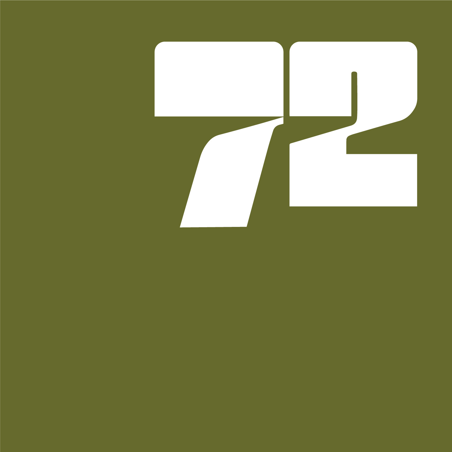
72
I’m not even sure if this should be called an illustration. This exceptionally simple graphic was inspired by a fleeting image seen in the background of a documentary about events in America in the 1970s. The original graphic in the film was multicoloured and a bit too loud. I recreated the 72 in reversed out white. Avocado was chosen for the background to represent the ever-popular colour of the era.
