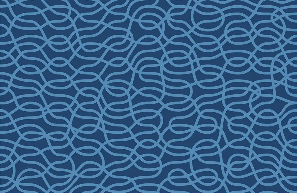
Detour Pattern Design
Detour’s Pattern Repeat Revolution
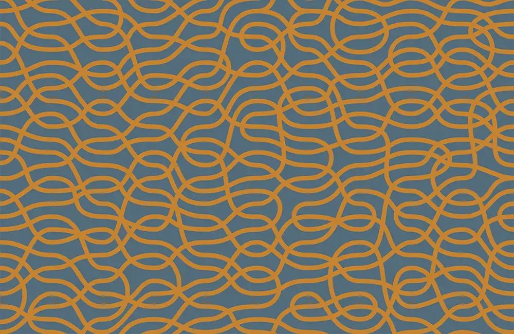
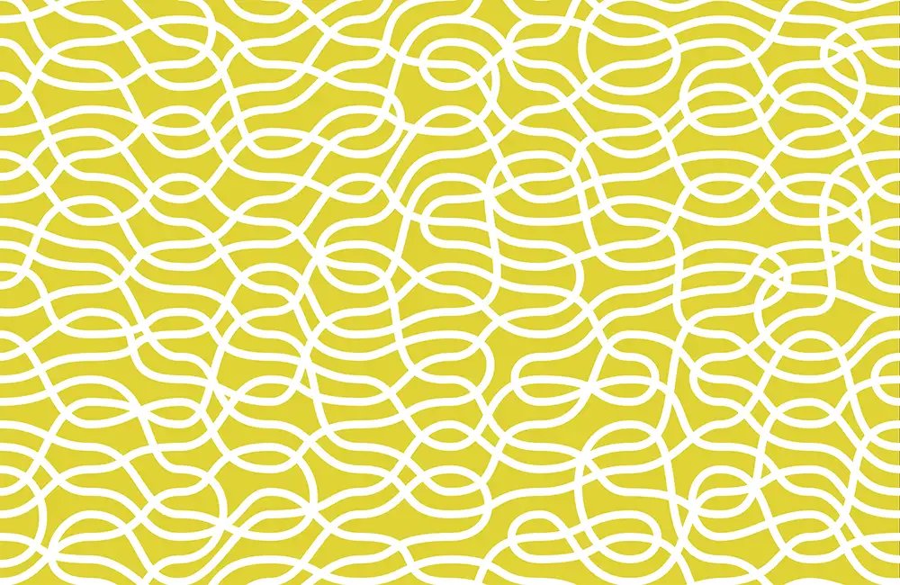
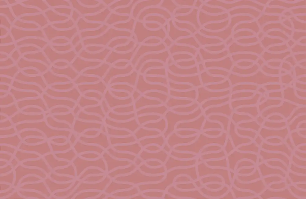
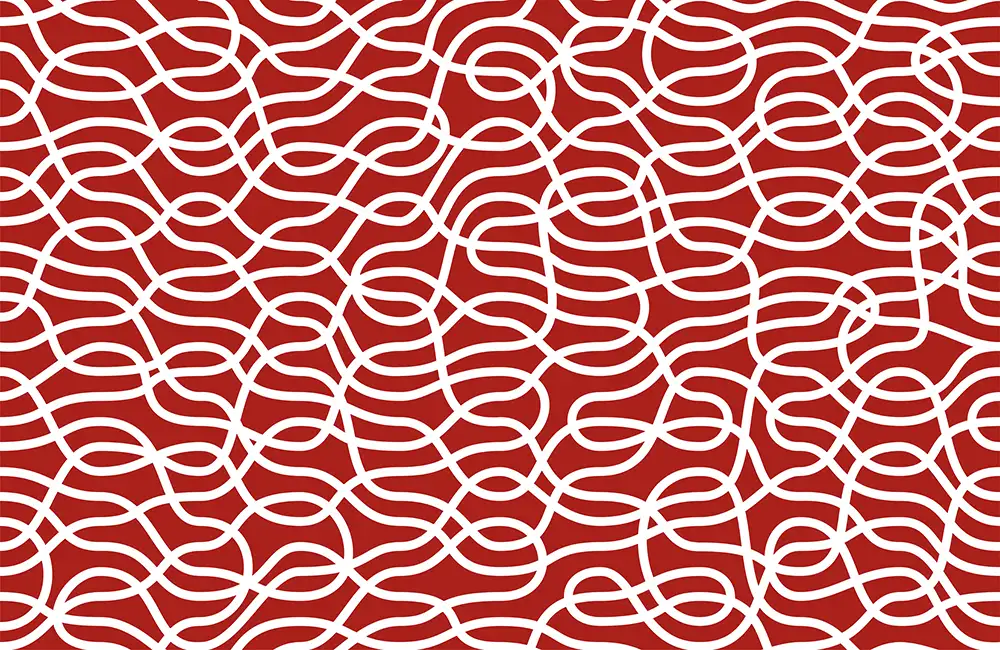
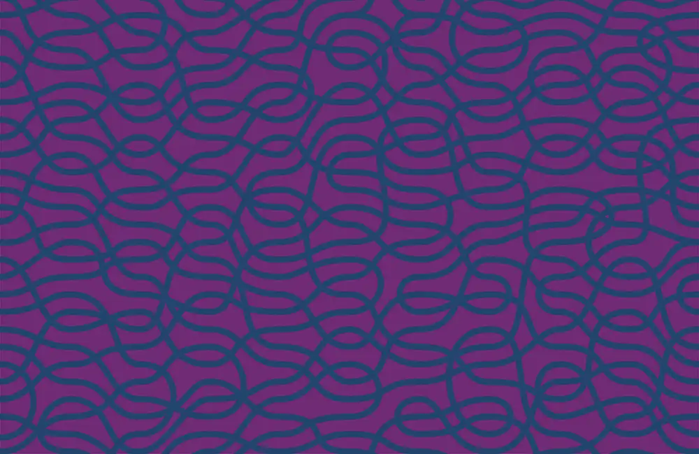
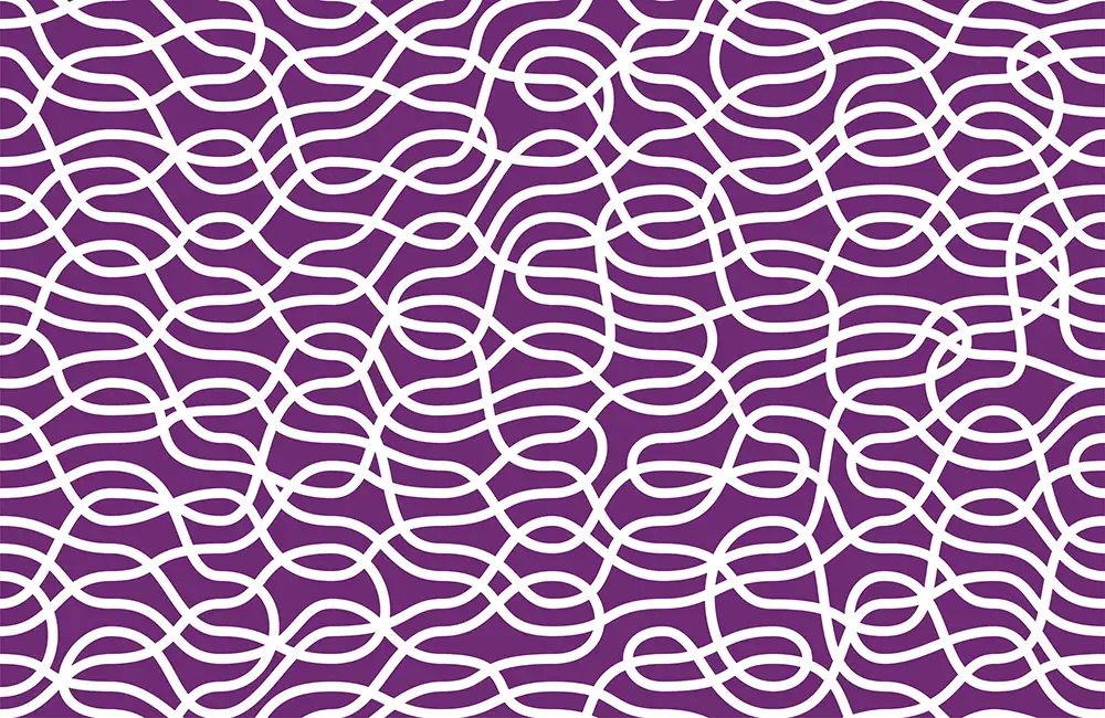
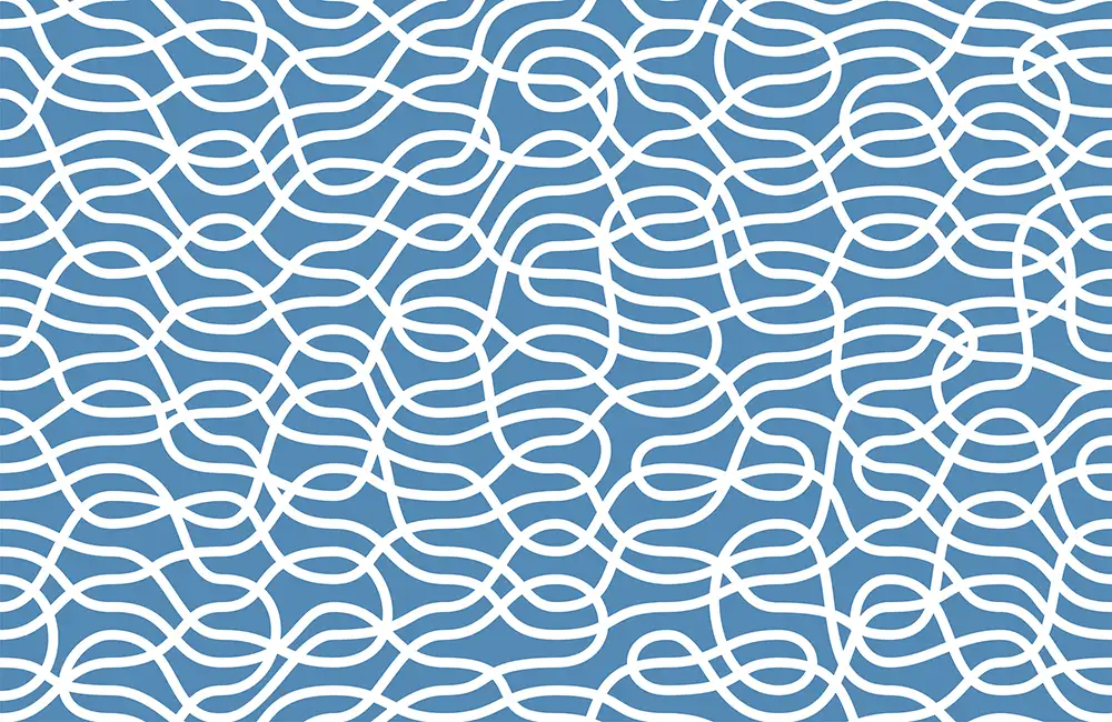
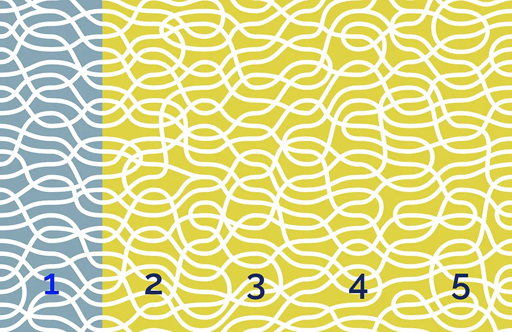
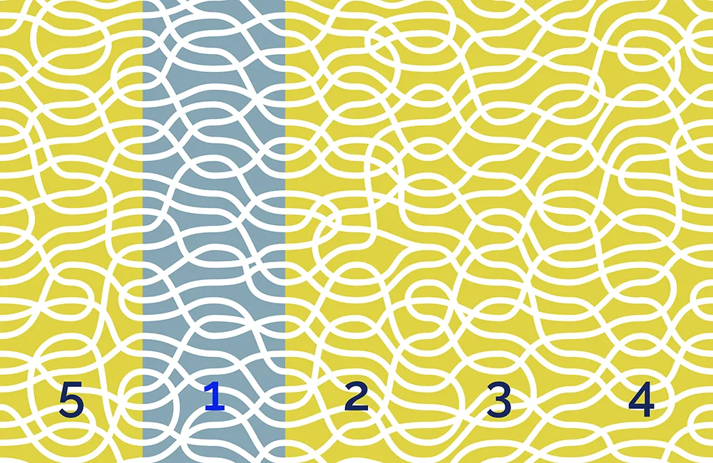
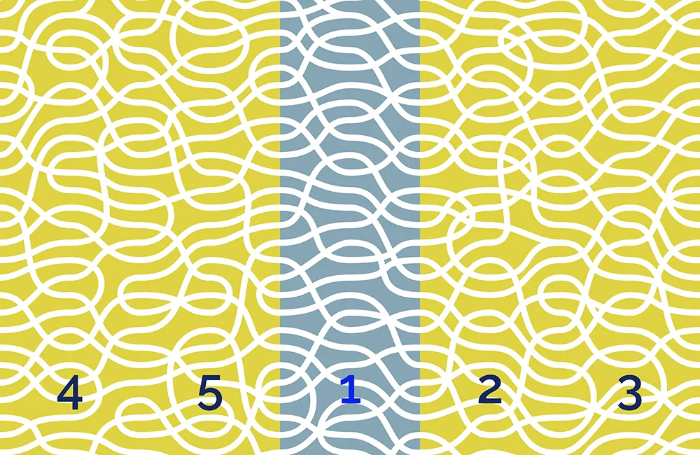
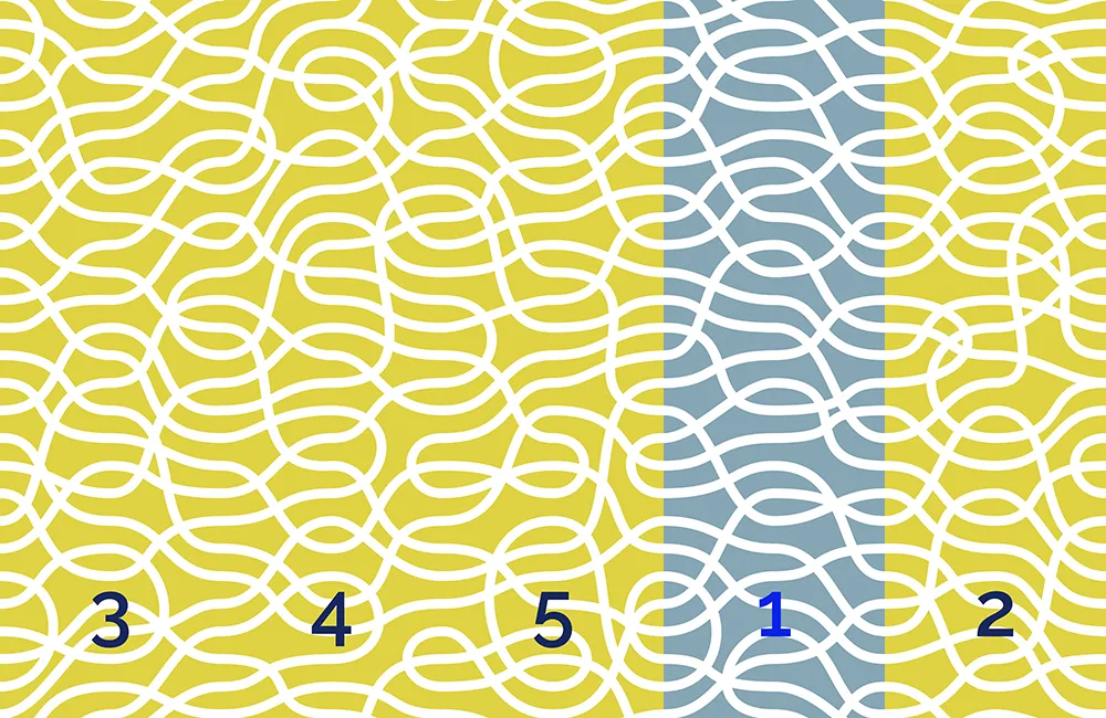
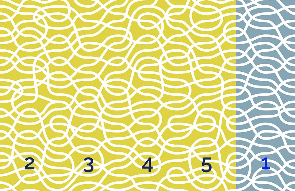
The pattern repeat of Detour works by using a series of vertical, equally-spaced, cross-over points. The paths are always smoothed to horizontal when they cross these points. Rather like a series of points on a complicated railway line.
Using this system every drop of wallpaper can change how the overall pattern looks by moving it up or down to whichever cross-over point is chosen – see visual.
Detour Pattern Design
Detour evolved from my Ribbons Pattern Design. Instead of paths of varying thickness, Detour is bolder by having all the paths the same thickness.
Inspired by Scalextric And Keith Haring
The racing track of Scalextric was an influence in this design. For Detour I felt the design could be simpler with the paths crossing over anywhere. The most time-consuming part was adjusting the design so that the paths and crossovers were evenly spaced. The more I look at it the more I found awkward areas that needed to be reworked.
Keith Haring would have been my age now, had he not died of AIDS in 1990. He was a prolific artist with a distinctive keyline style of painting murals. He used the blacked-out advertising spaces on the New York subway to create ad-hoc artworks. I was reminded of his talents in a recent BBC documentary about his tragically short life. His ultra fast keyline work was another influence in the making of Detour.
Colour Combinations
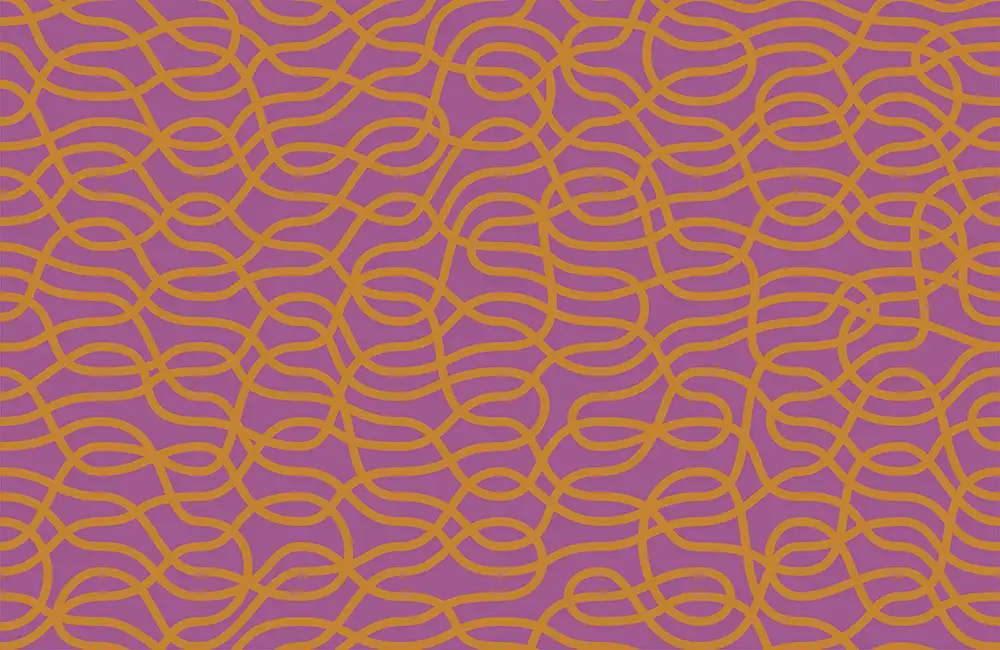
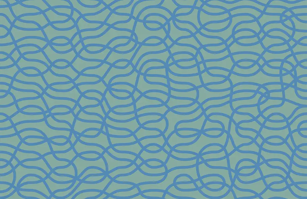
For my pattern designs I use a catalogue of numbered, standard colours. There are currently 39x colours in my swatch library for me to choose from. For example – 0 is white and 33 is black. I have selected a colour for the paths themselves and a second colour for the background. This totals 39 x 39 totalling 1,521 different combinations – less 39 for those where the paths are the same colour as the background which comes to a total of 1,482 possible colour combinations.
Using Only One Colour
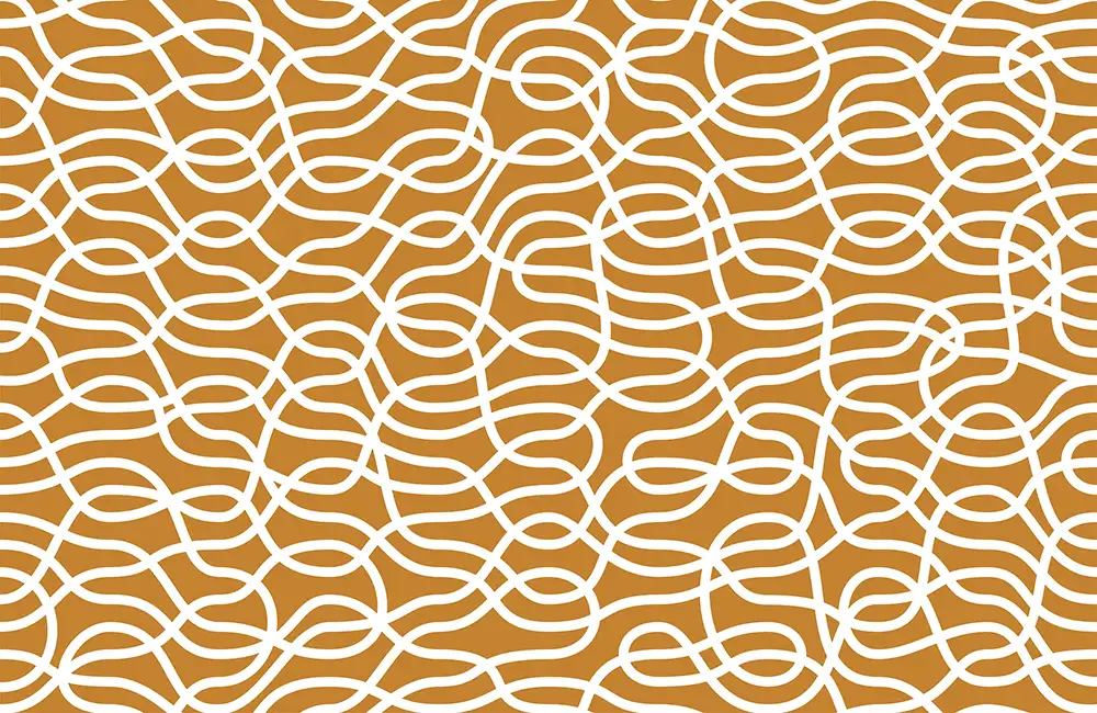
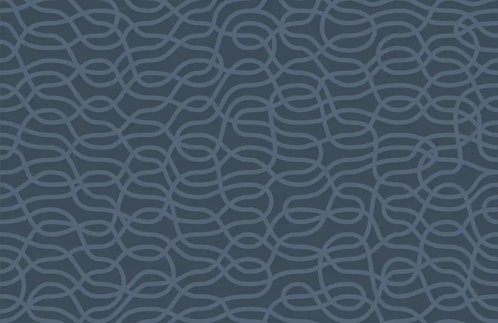
Working through each of the combinations I found that using white for the paths and just the background colour works very well too. So the pattern would work for companies such as Farrow and Ball who print their wallpapers using white onto a range of their paint colours.
Creating a Numbering System
With so many combinations it was vital to have a strict numbering system. I have used the code of the ribbon swatch followed by the colour code of the background, so for instance 31-4 has blue paths on a teal coloured background.
Placing The Pattern In A Location
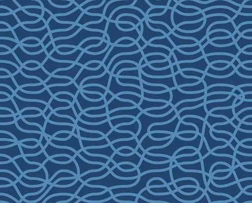
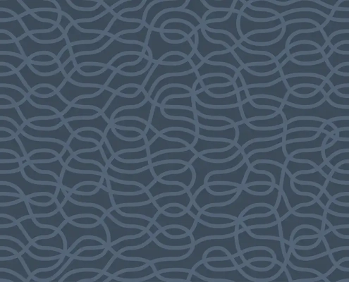
To give context I combined a selection of finished designs with a straight-on shot of the chair used in my design for Mid Century Modern Chairs. Adding a fake carpet and simple skirting board. For every image I altered the colour of the real chair to complement the surface wallpaper. For each design I also created a simple version that was just the pattern, to show how the design could be used for fabric, wrapping paper, and other surfaces.
Large-Scale Surface Pattern Design
I think the flexibility of this pattern would make it ideal for extra-large surface areas, such as airport lounges or office receptions. It would also be stunning when etched into glass. The design is vector-based so can scale to any size with no loss in quality.
