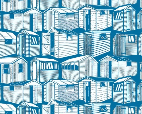
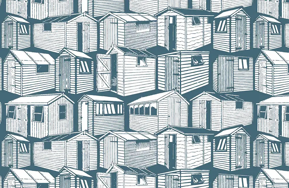
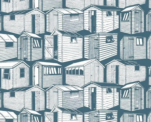
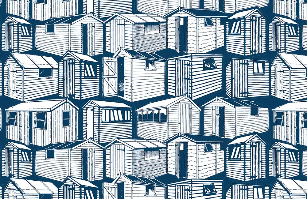
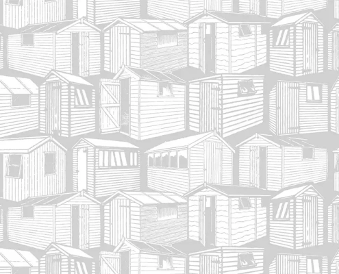
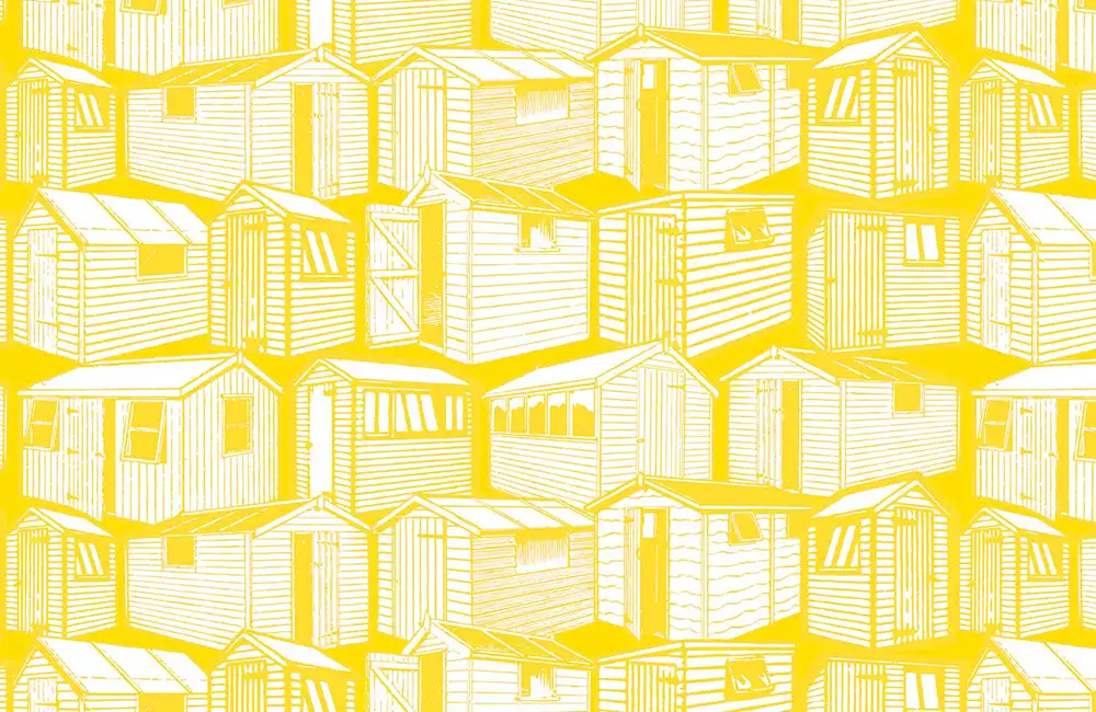
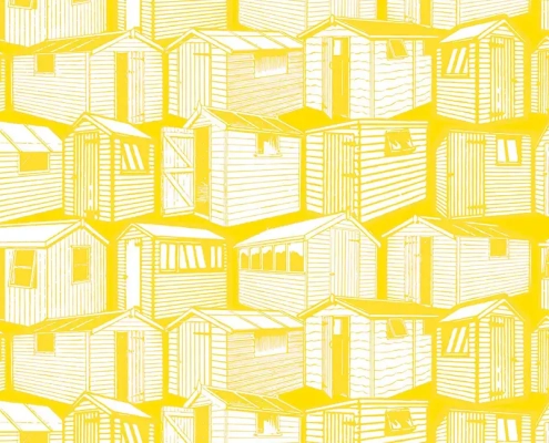
Sheds Pattern Design
Sheds Inspiration
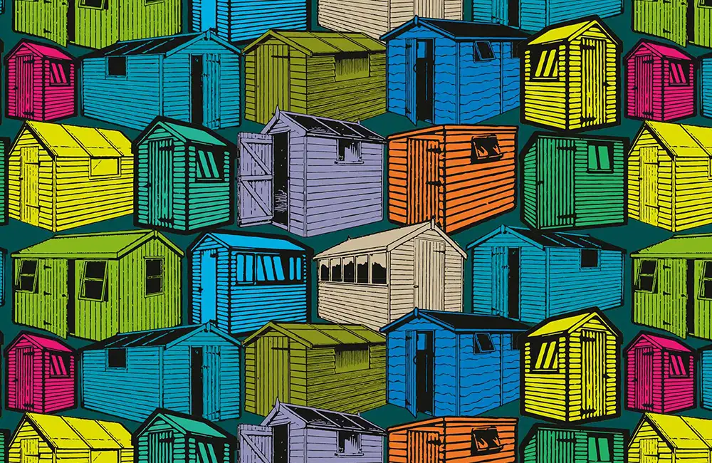
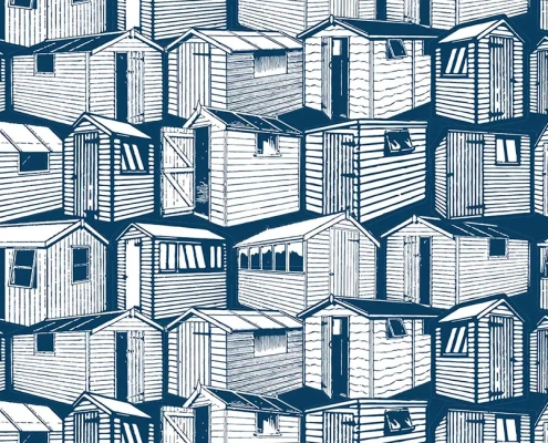
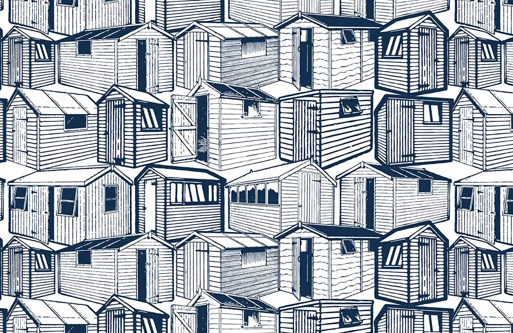
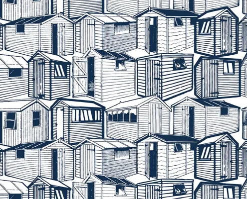
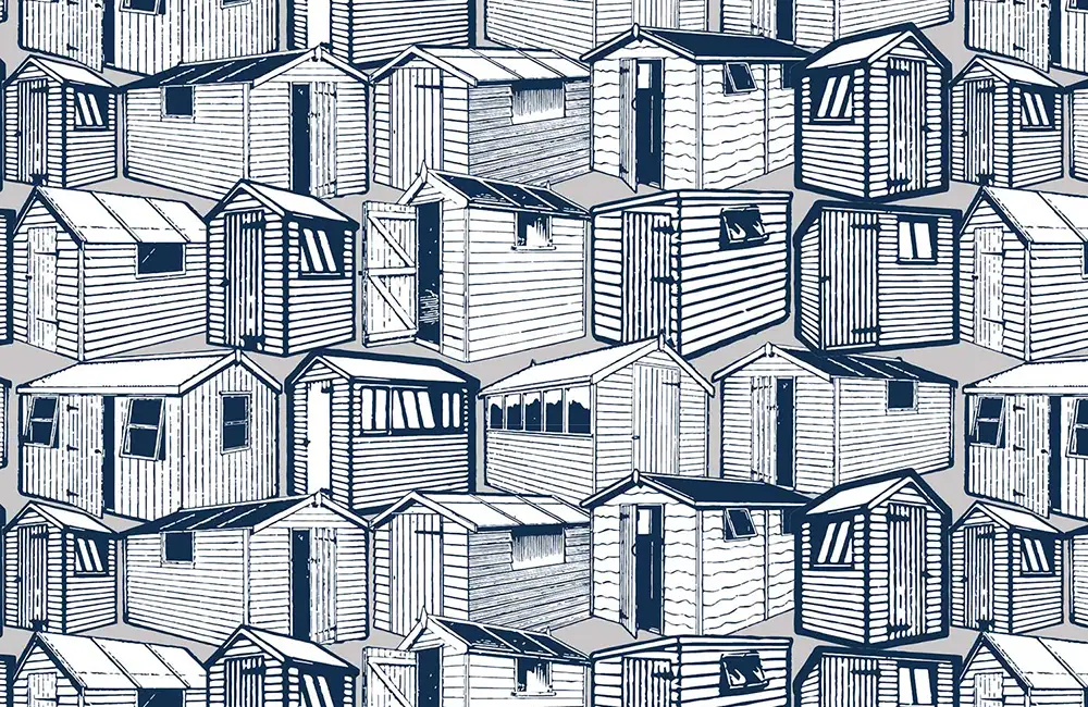
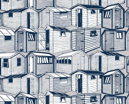
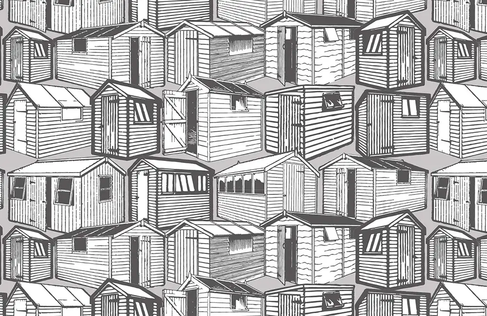
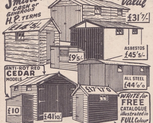
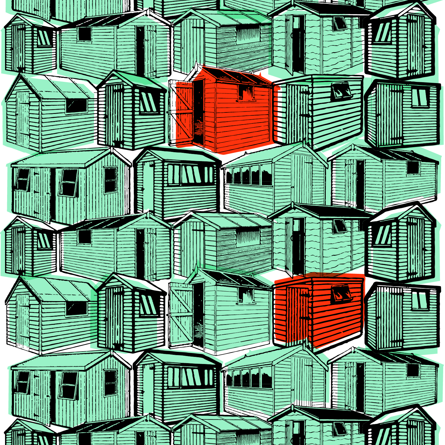
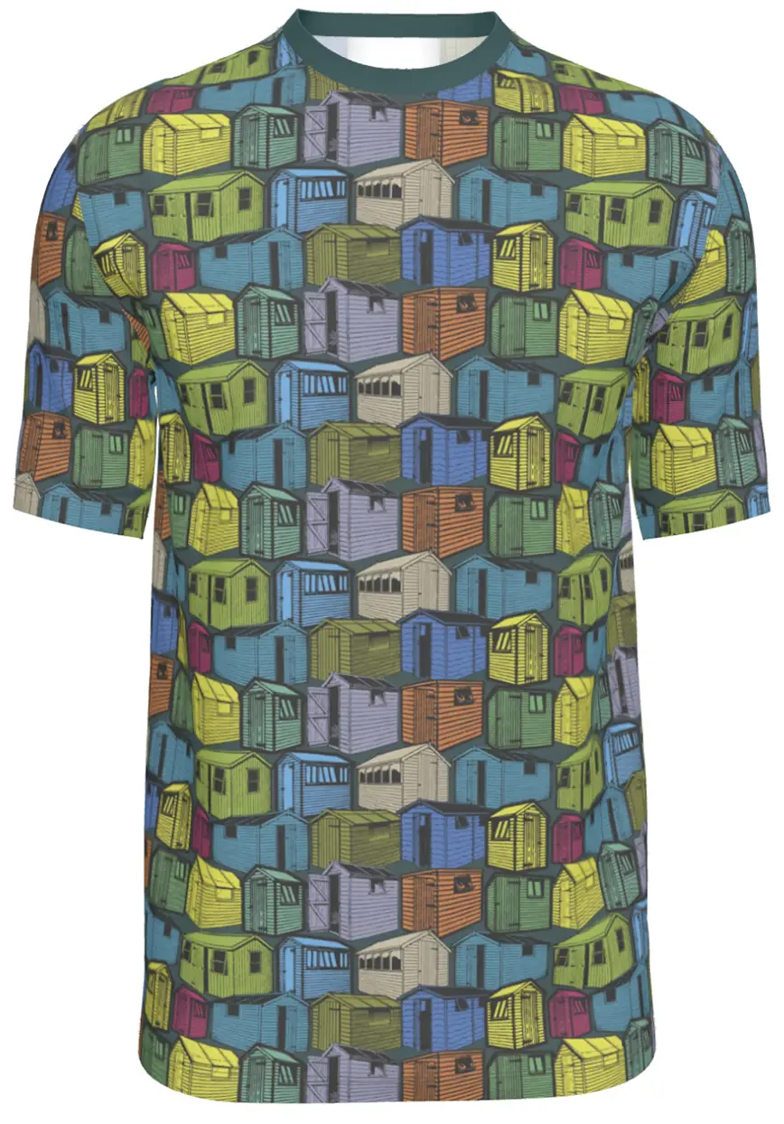
Sheds used to be simple, basic storage. Now they feature on TV programmes such as George Clark’s Amazing Spaces and the competition for Shed of the Year. This design is based on the most basic of sheds seen across the country after the war. Sheds pattern design was inspired when I saw rows of sheds on a friend’s allotment.
Finding References
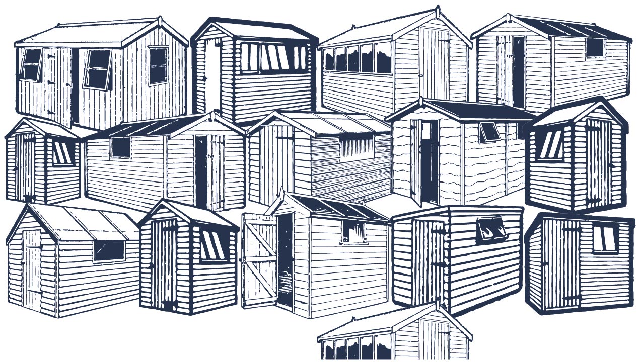
I found a series of old shed adverts in charity shop magazines but most of them had text and overlaps as in the sample here. I wanted to be able to adjust, scale and colour each individual shed. I found a selection of individual, isolated, sheds scanned them all and cut them all out in Photoshop. They could then be roughly scaled into proportion.
Creating The Pattern
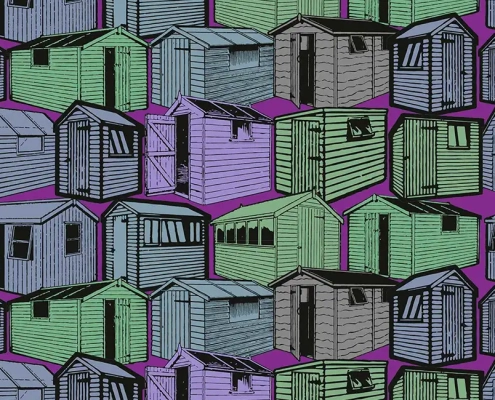
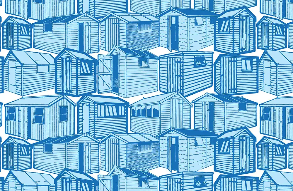
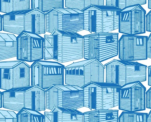
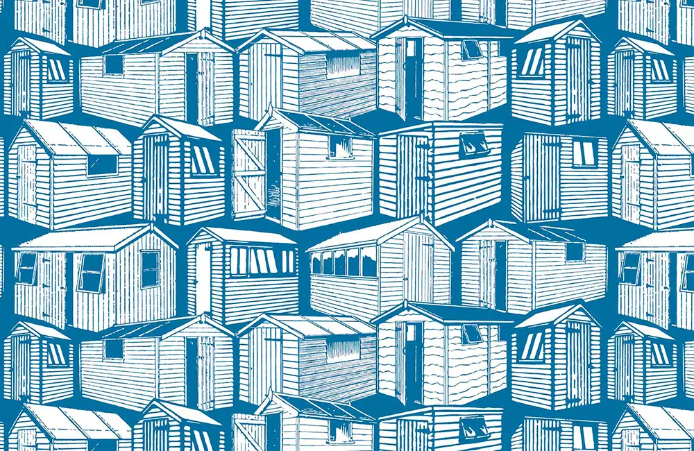
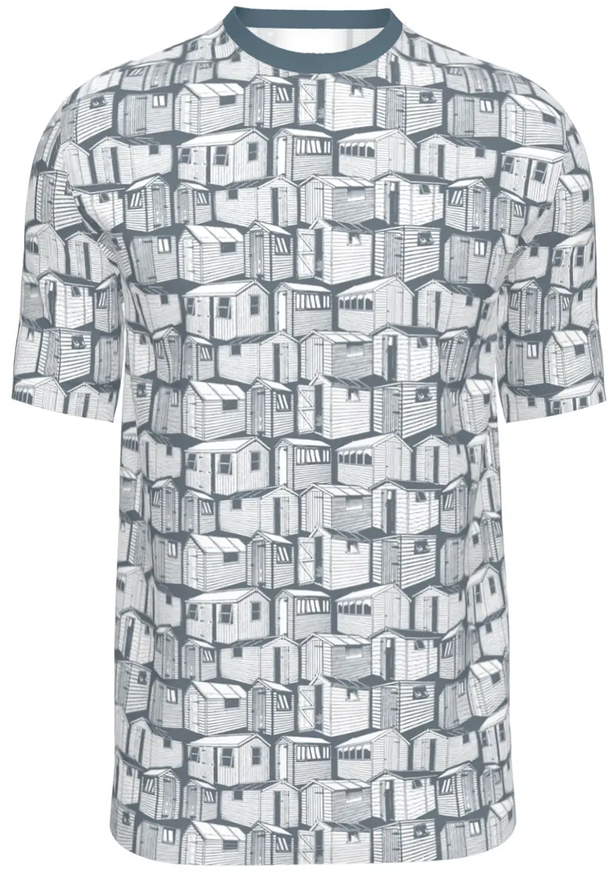
To make the pattern work, each row of sheds sits on top of the row above. Making them appear to recede into the background. The fourteen sheds then repeat horizontally and vertically as a block. There was one shed that had to be repeated as a patch so that the spacing could be kept tight – like the original advert.
Colouring Elements Of The Design
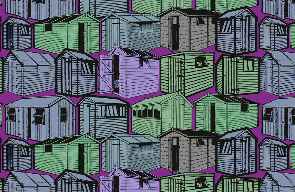
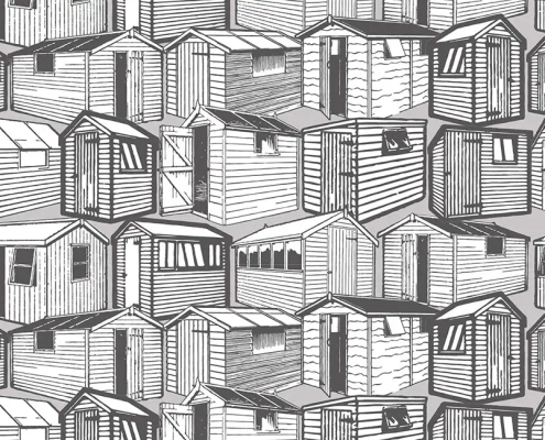
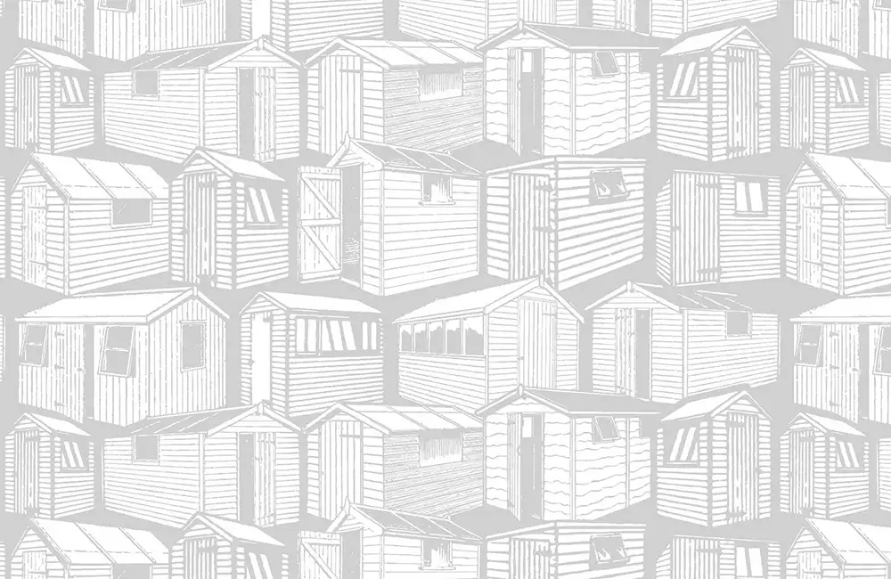
As all the sheds were made up of filled paths and solid backgrounds. I could alter each of these separately – plus the background to the whole pattern too. The orange version (N12on8-12) has the shed’s paths coloured the same as the pattern background. The orange colour is only used on the background to each individual shed.

